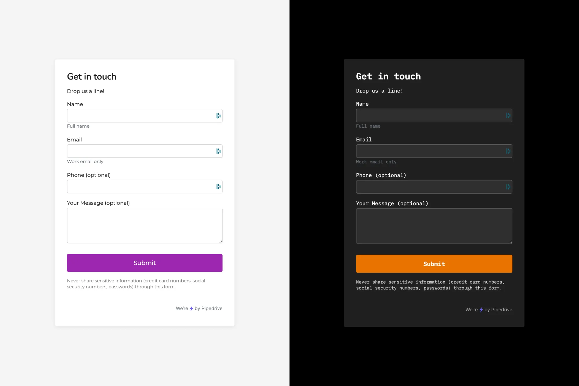
I was tasked to design the customization options for Pipedrive Web Forms – a functionality we were completely overhauling.
Interface customization
A big challenge was to provide an adequate level of visual customizability so that the forms would not look out of place when embedded in our customers’ websites with varying visual identities. This was my responsibility for this project and that’s what I will be focusing on.
We conducted exploratory interviews with a number of customers to understand their sales process and workflows and specifically about web forms and how they’d like configured these.
We also looked into our customer base and looked at some actual customer websites with a wide selection of visual looks, and listed out needs to make a form fit there. Based on all the info we gathered, we decided that our users would be able to choose:
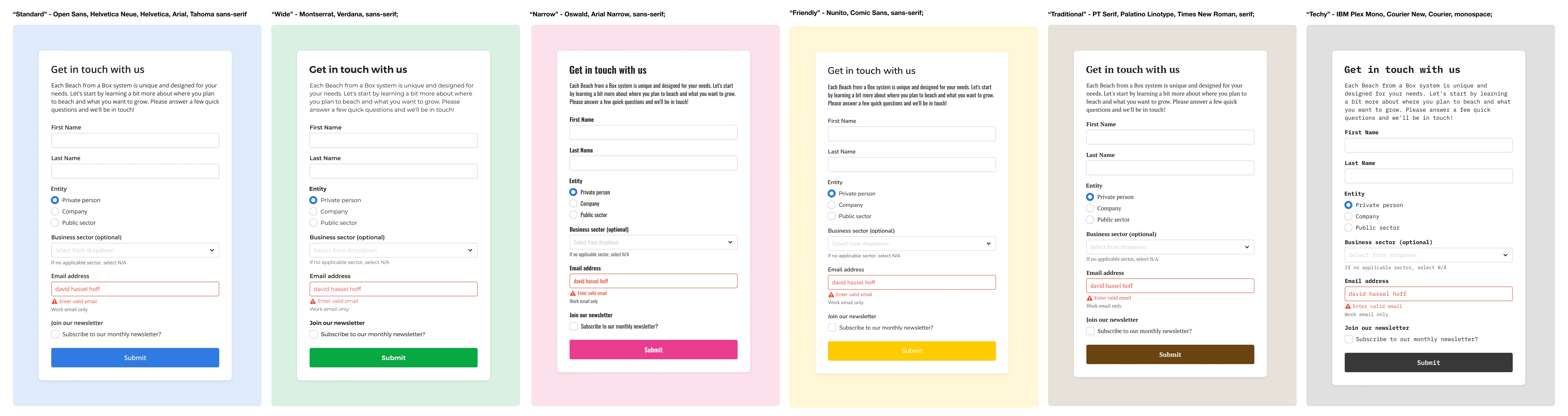
- Text style (5 styles)
- Border radius (3 levels)
- Primary color (from which we’d automatically derive a light background hue and accent colors)
- Light/Dark Mode (mainly to accommodate different styles of websites)
- Overall sizing (S, M, and L sizes for text and fields)
- Layout (labels on top of fields or labels and fields side by side)
- Branding (logo upload capability)
Typography
Typography plays an essential role in any visual identity and I wanted to make sure that the embedded web forms would not look out of place on any website. I didn’t want to limit our users to web-safe fonts only, nor did I want to present them with the whole Google Fonts palette.
I created a short list of curated text styles, using fonts that would stylistically match most common visual identities. I named these descriptively instead of by the actual font name, so that the users would have an easier time configuring the look.
Color and contrast
We would allow our users to freely choose the primary color of the form to match their branding. The color would be used for the submit button background and also focus states for the fields and we’d also derive the form background options from that picked color. As the submit button would use the user-picked color verbatim, we had to make the label on the button dynamically switch between white and black, depending on which has better contrast with the background color.
Design system
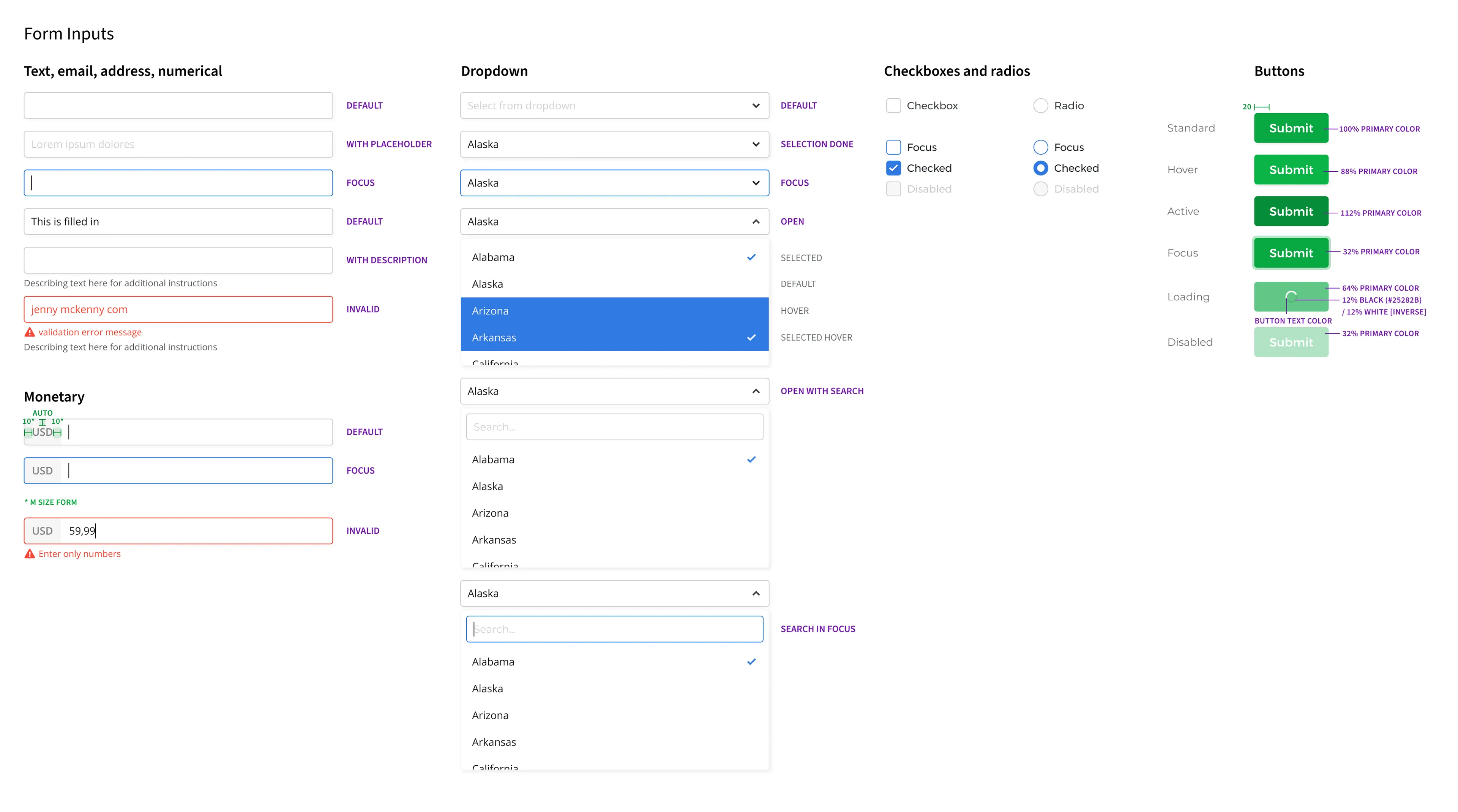
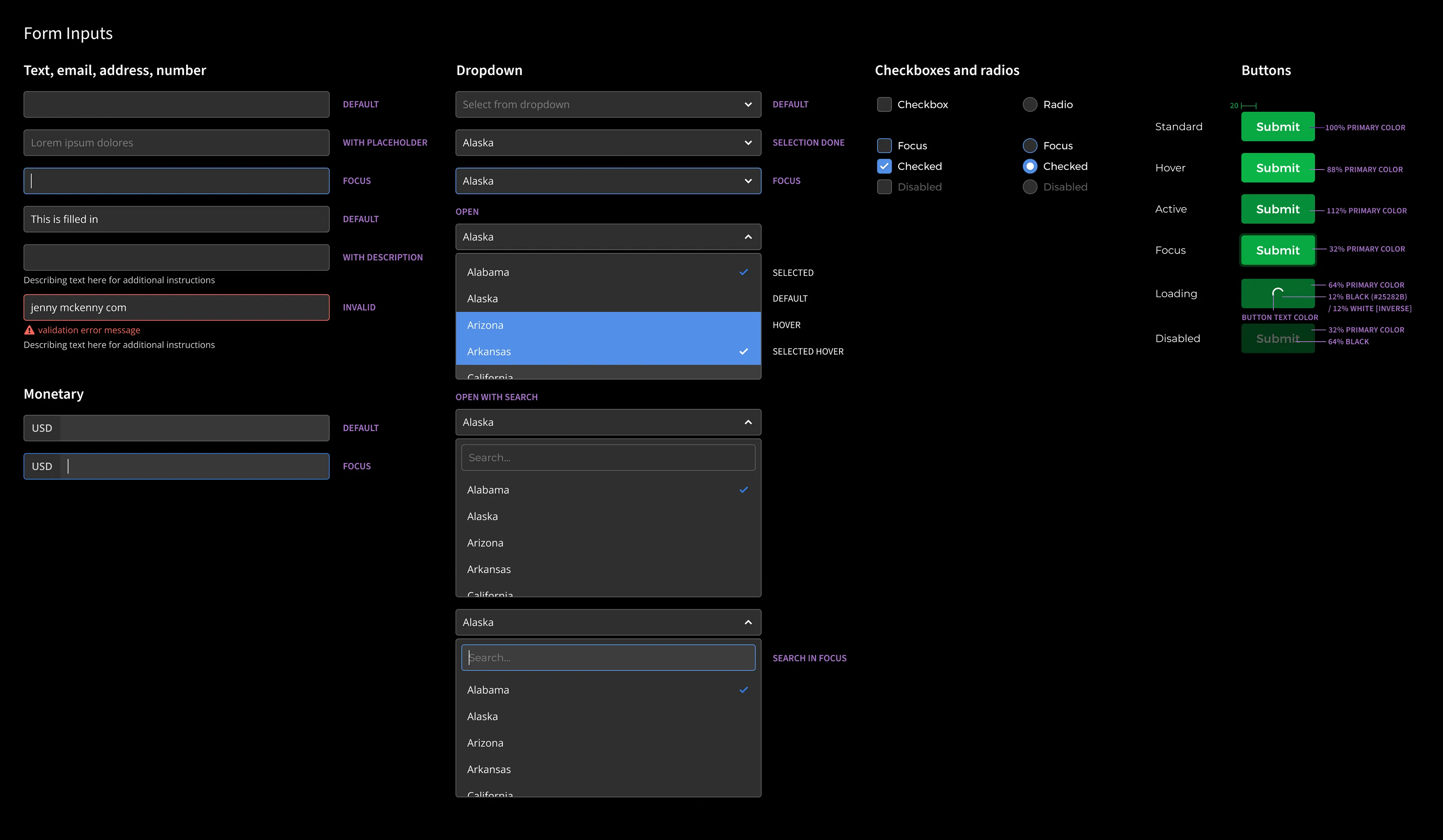
The customization scope we wanted to offer our users was quite generous and to accommodate it, I created a whole new mini design system in Figma, consisting of text and color styles and visuals for all the necessary form fields in their various states.
This little collection of components actually reinvigorated my interest in design systems and paved the way for my next steps at Pipedrive as a Design Systems designer.
Coded prototype
It would have been overwhelming to draw out all the permutations of the properties mentioned above and to be able to manage the design file and refine the designs in Figma. Or at least I could not imagine that. So I used my coding skills to create a “dirty prototype” in Codepen. This proved to be extremely useful in polishing the finer details and later communicating all of the customizability options. Not to mention design handoff for development.
End result demo
This is a demo of the actual product. Note that I did not design the whole flow end-to-end. For example, the initial setup wizard and a big part of the form content editing interface were carry-overs from another feature.
Objectives and Key Results
Without going into too much detail, the main objectives for the project were to:
- integrate Web Forms with the newly created Lead Suite;
- make set-up intuitive and simple;
- start supporting different Pipedrive custom fields;
- include reCaptcha;
- introduce layout customization options;
- introduce more styling options;
- have a customizable success page text.
To give you some idea of the key results we were aiming for, they were along the lines of:
- a specific number of companies that would have adopted the feature in 6 months’ time;
- a specific percentage of qualified leads that would be created through Web Forms;
- a specific number of submissions that would come from Web Forms;
- a specific percentage of customers would continue using Web Forms after 1 month of using it.
Extra topic: Form validation
As there were no written best practises in place in our design team for form validation, I decided to approach the controversial topic with care and attention. I used “Form Design Patterns”, a Smashing book by Adam Silver, as a reference.
We’re validating all fields when the user removes focus from a field (known as the onBlur() event for the technically adept) and secondly, validation is carried out as a user hits the Submit button. The onBlur() approach allows the user discover and correct mistakes while filling in the form, and the second validation when Submit is clicked, fool proofs the form as the user might not focus on some fields at all.
Basic stuff really, but the aforementioned book allowed to have good clarity on best practices and communicate expectations to developers.