Intro
| What? | A hiring assignment to design an online banking product for old-age pensioners. Time capped to 5 days initially. |
| Why am I publishing it? | The assignment was rejected. But I didn't stop there and applied the feedback, so I want to show the work. |
| Short on time? | Want to see the final version? Jump to Version 3. |
Assignment
The problem
As all aspects of life are becoming more digital, the older generations are forced to use new technologies that did not exist before. This experience can be overwhelming, cause anxiety and easily lead them to making mistakes and eventually rejecting these new technologies.
My task
To design a modern, well-integrated and intuitive online banking product for old-age pensioners.
Standard design thinking process: build empathy → define JTBD → build prototype → validate designs.
The design must be simple, intuitive and delightful to use. I must keep in mind the types of accessibility issues that these users may have.
Process
Research
I completed two 40 minute phone interviews – with a 68 year old and a 72 year old. For secondary research I searched the web for products for that target audience. I also found a 2025 masters thesis around the topic which became the main source for inspiration.
Synthesis
I narrowed my focus to a certain persona and defined the user stories to cover with my concept.
First UI
I mocked up low-fidelity designs in order to not focus on pixels.
High fidelity, prototype and validation
I drew up high fidelity designs created a prototype and tested it.
Learnings and next steps
I noted down ideas from testing and reflected on the process.
Interviews
The 68-year-old “Tom”
- Is a customer of private banking.
- Uses a banking app on his phone.
- Does not use a computer.
- Logs in 4 times a day to check on his investments.
- Manages all transactions on his own.
- Consults with family or banking rep on some asset sales.
- Is super happy with the app interface.
- Has set up double confirmation and is happy with security.
- Has no trust issues as no problems have occurred.
- Visits the office quarterly for info meetings.
My 72-year-old aunt “Tina”
- Uses online banking only via computer.
- Does not have the mobile app.
- Logs in only when she needs to pay bills or transfer money.
- Manages all transactions on her own.
- Does not consult her family.
- Is happy with the online experience.
- Has no trust issues as no problems have occurred.
- Visits the bank office only when needed.
Conclusion
The two people I interviewed were similar in age but miles apart in their habits and needs. I wish I had managed to interview more and even older people. I noted findings from these interviews but focused my persona more around findings from the master’s thesis.
Insights + HMWs
Market and competition
I found senior-oriented interface examples from Chinese banks. In Europe and the US, less so. It seems to be more common to market simplified banking experiences for children. Visuals or a were hard to come by for both cases.
A considerably more established category is banking for children, but as a part of this research I didn’t focus on that.
Here are some key outtakes from my secondary research and HMW’s:
Peace of mind as the #1 driver
“I can’t sleep if bills aren’t paid.”
How might we give seniors the reassurance they currently get from a branch visit, at home?
They’re afraid of the irreversible mistake
“I might press the wrong button, so I don’t trust myself.”
How might we help seniors feel confident that they can’t get it badly wrong?
They want to pay bills the moment they arrive
“Five euros for the transfer? I want to pay the whole year at once.”
How might we let seniors settle an obligation the instant it appears, and know it’s done?
Fraud anxiety, amplified by family and media
“I don’t trust the internet back home. It is safer on the bank’s computer.”
How might we help seniors feel safe from fraud without feeling suspected or scolded?
They want to be treated as equals, capable, not as burdens
“Do you think I can’t afford it?!”
How might we help seniors bank independently in a way that respects their capability?
My main secondary research source: “Improving Digital Banking Accessibility for Older Adults Who Visit Branches” (MA thesis by Rain Jaaksoo).
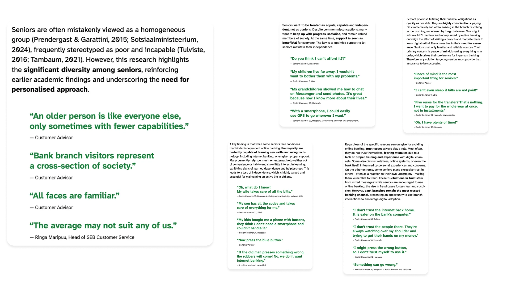
Link to affinity map from thesis
Final persona
Tina, 82 years old
Lives in a private house in a small town.
Has used internet banking on her computer before but the computer has become obsolete. Her children have now gifted her a smartphone.
Uses messaging apps to stay in touch with children and family. Reads the news on it. Exchanges photos with a lady friend from another town.
Her main activities around money are to pay her bills and send money to her grandchildren.
Her local branch was recently shut down and the bank promoted a new simplified app mode to cater for youngsters, elderly and disabled. Tina’s grown children installed the app.

Concept
Banking that feels calm, clear, and safe
Zen Mode is a concept for a banking experience built around one emotional promise: peace of mind.
The name plays on two meanings
“Sen” as in senior — the primary audience this product is designed to support. “Zen” as in calm, clarity, and reassurance — the feeling the product should create.
The product is designed for people who need banking to feel simpler and safer: older adults managing their own finances, but perhaps also children or other users who could benefit from a simplified, lower-risk banking experience.
What Zen Mode is
It’s a mode in the banking app which can be switched on or off. I designed the mode based on the app of my home bank, LHV.
Simplifies the banking app to a bare minimum, focusing on:
- One account at a time
- Making payments to familiar recipients
- Reassurance
- Accessible design

Home screen
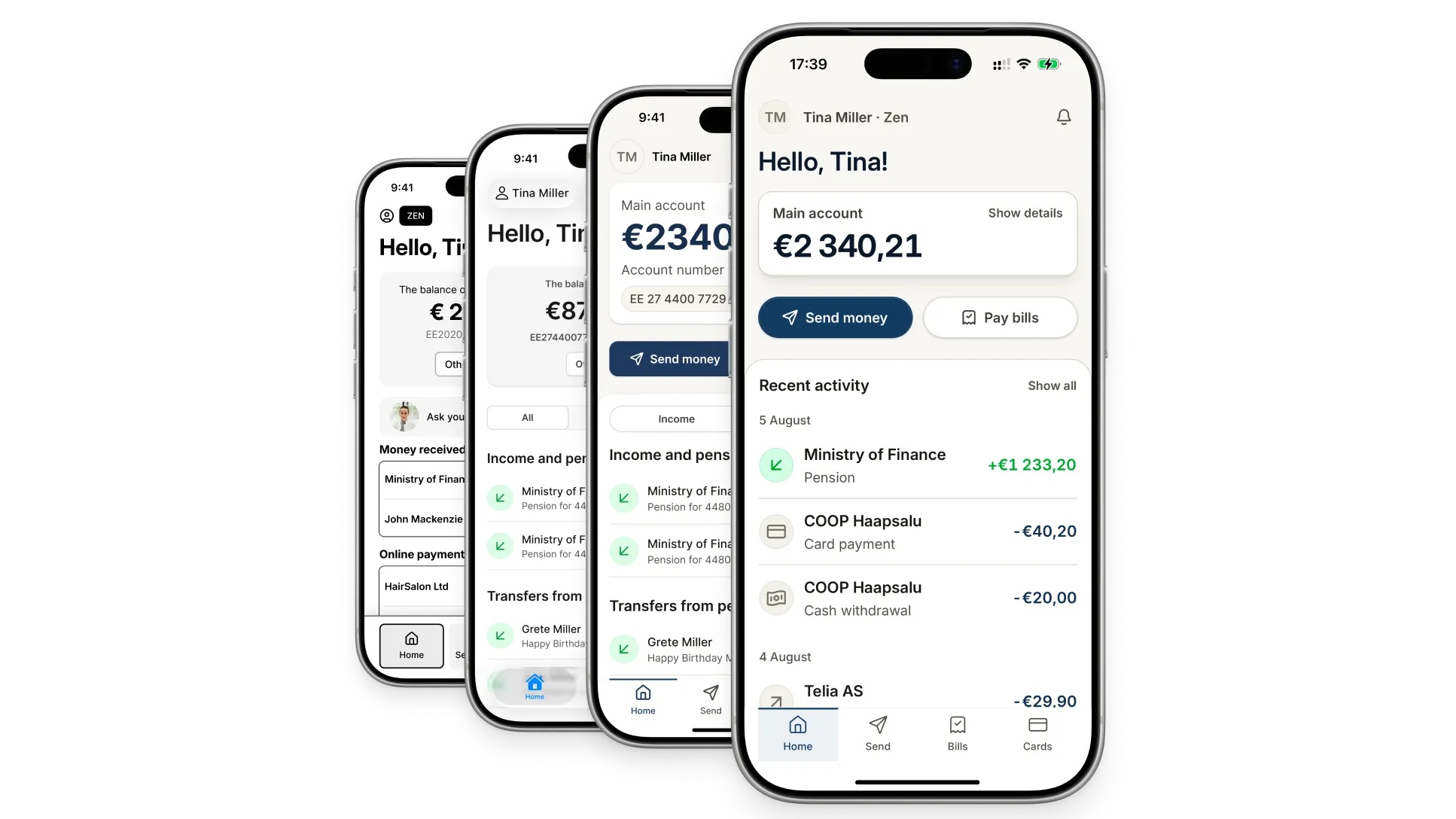
Home in a regular banking app vs Zen Mode v1
A regular app has many actions available, lets you swipe between accounts, and shows transactions as a homogeneous list.
In Zen Mode v1: unnecessary actions are stripped out; the only action on the account is to copy it; switching accounts is done via a more traditional button and dropdown; transactions can be filtered by direction and are intelligently categorized for ease of scanning and clarity; the main menu is simplified; and payments are split between two concepts — 1) Send money, 2) Pay bills.
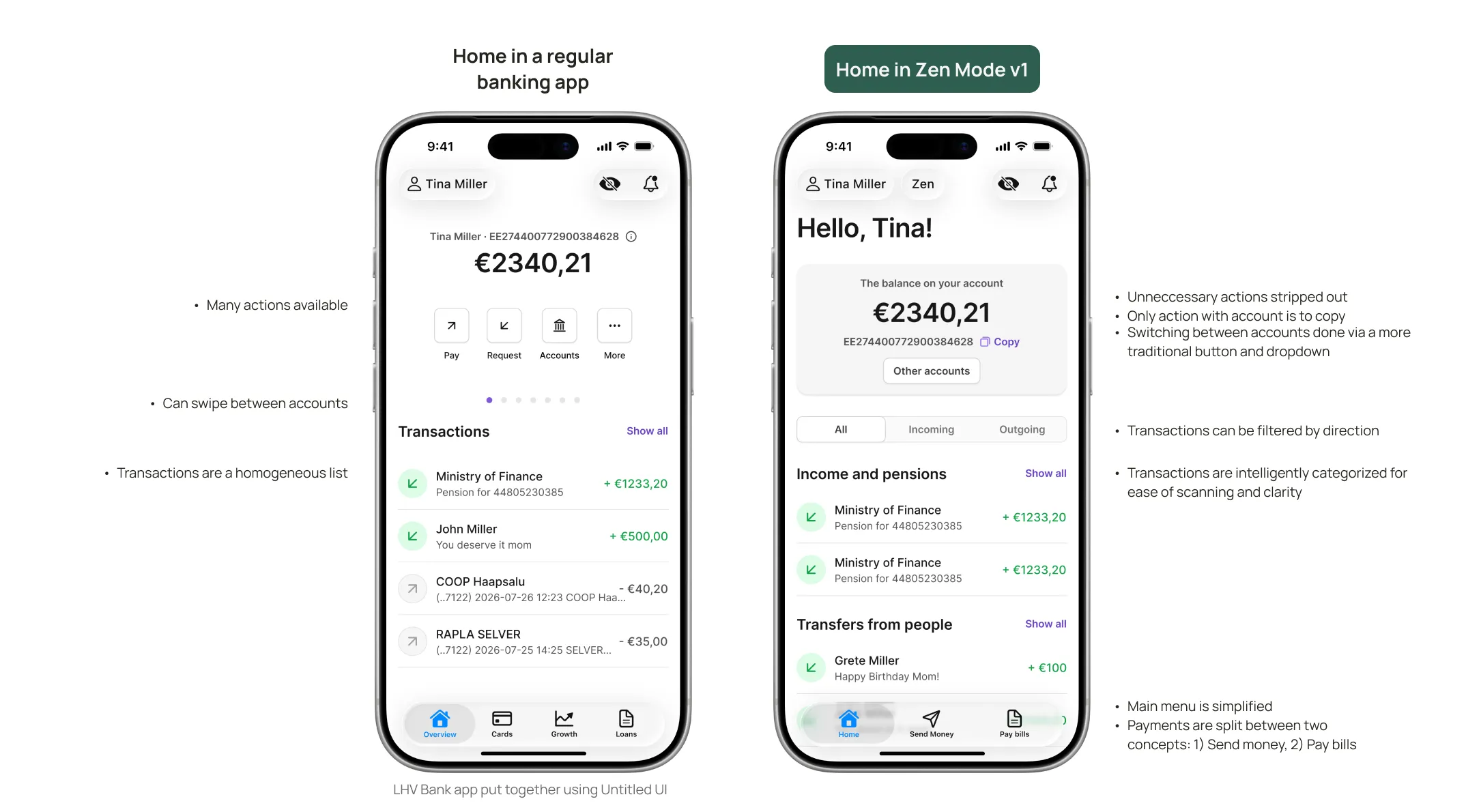
Left: LHV Bank app put together using Untitled UI.
Send money
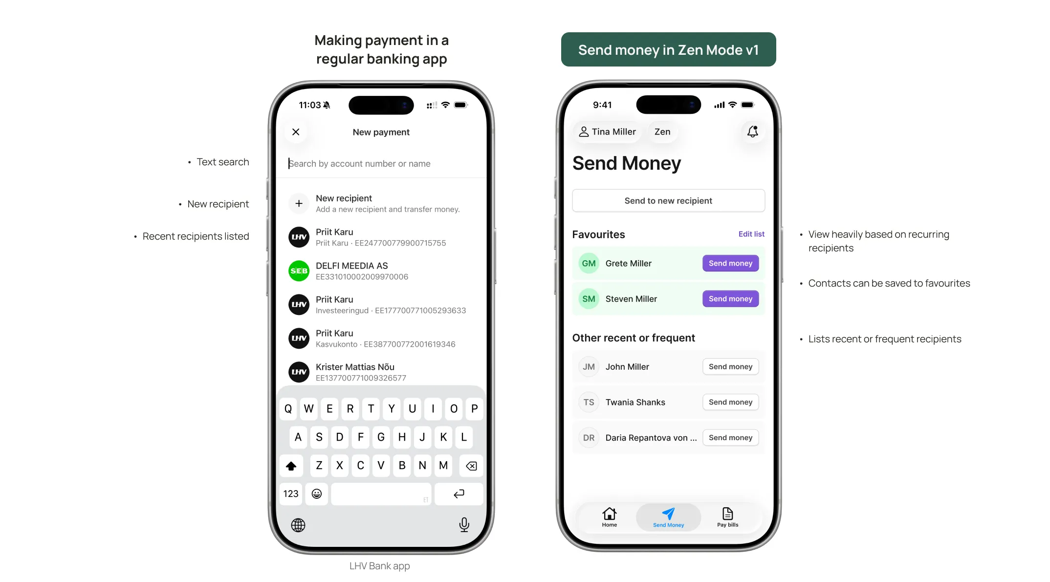
What is the Send money concept?
- Meant for sending money to private individuals.
- Presents a favourites list.
- Minimises manual entry.
- Prioritises frequent recipients.
Why I think it works well
- The elderly usually have a limited number of people they send money to (mostly family).
- A favourites list with simple payment and minimal data entry could prove useful for empowering the elderly user.
What needs work
- Text search would still be nice in a “Send to other” view or similar.
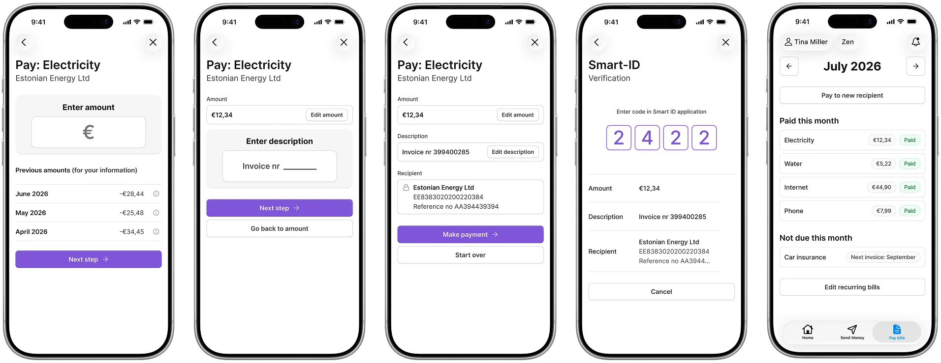
Send money — Payment flow
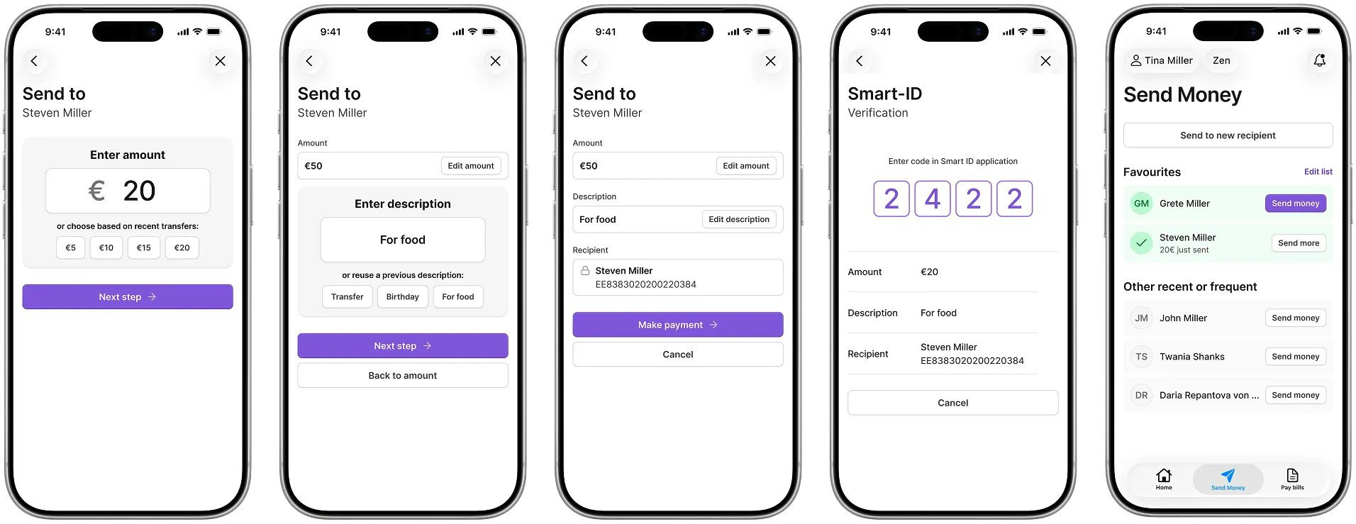
Pay bills
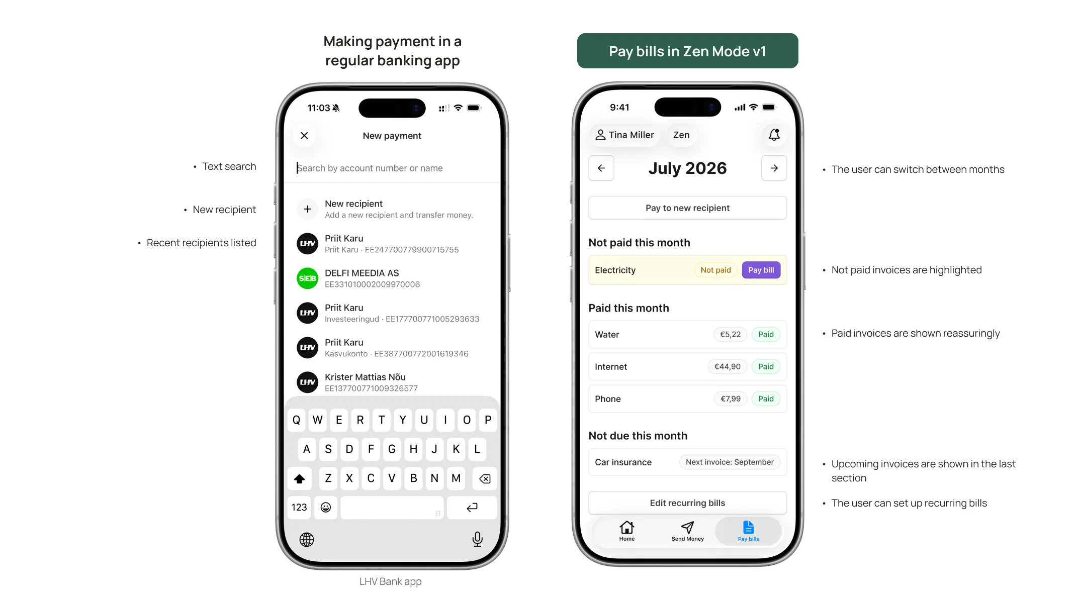
What is the Pay bills concept?
- A pre-set list of recurring payments the user completes every month.
- Either set up by the user, their trusted person, or populated automatically through integrations.
- Setup includes cadence (monthly, quarterly, yearly); bills are displayed based on this cadence.
- The user is notified when a bill is due and not paid.
Why I think it works well
- Recurring bills become a checklist.
- Clear overview of what is paid and what isn’t.
What needs work
- With a manual setup, changes in service providers or billing cadence require manual intervention.
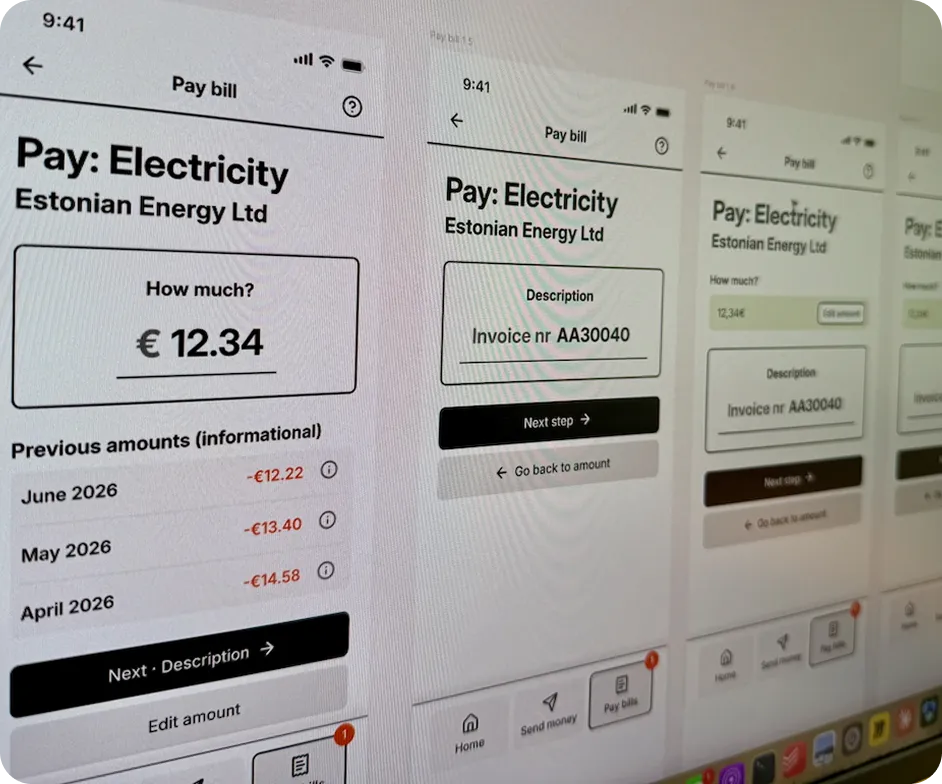
Pay bills — Payment flow
Version 1
Prototype
You can test everything that you just saw in the prototype.
Try 1) sending the favourite contact Steven some money, or 2) paying the electricity bill.
Yes, it’s a Figma prototype. More on that later.
Validation
Validation visit
I drove to visit my aunt to test the prototype in person. I translated the prototype to Estonian and filled it in with relevant sample data.
I gave a general intro and emphasised that it’s a prototype testing the design, not her.
I asked the interviewee to look at the views for a while and describe what she saw.
I then gave her two tasks: Task 1: Transfer money to her grandson. Task 2: Pay her electricity bill.
Quick validation outtakes
Money direction filtering — questionable
Direction-based filtering needs more investigation. The prototype didn’t illustrate it well — selecting “Incoming” after “All” didn’t change the first part of the list.
Unexpected anecdote
TL; TR; but distinguishing between different transaction types (ATM Withdrawals, Online Transfers, etc.) might be useful.
Discoverability of Send Money vs Favourites
Discoverability of Send Money was not that great. Discoverability of Favourites was good.
Send Money / Pay Bills split needs more insights
Splitting the common banking concept of just a transfer to “Send money” (to individuals) and “Pay bills” (to companies) needs more investigation.
Further notions
- The interviewee always voiced out the text on purple buttons when moving between screens. Visual attention must be guided carefully.
- The interviewee also voiced out the “Back to …” secondary buttons in the payment flows. These might need to be less prominent.
- At some points the interviewee mistakenly clicked “Next step” too fast. Mitigating this would need exploration.
Version 2
I submitted the work to the hiring company and noted my validation findings.
And got asked to polish a couple of screens to further fidelity.
Serious signal for two things
- They were interested. 2. The UI didn’t cut it. I took this as a serious opportunity and went all in.
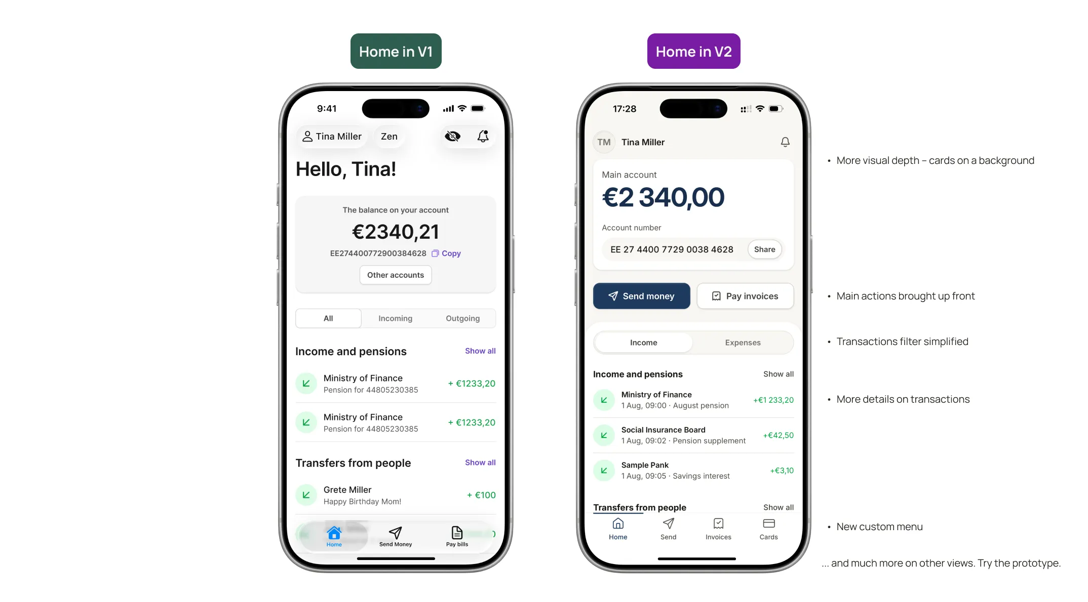
What I did
- Moved to Claude Code and used the Untitled UI React kit.
- Sought more UI inspiration and examined established fintech apps for visual / layout trends (Revolut, Wise, N26).
- Dug deeper into the design system and added more visual depth.
- Deviated from Untitled UI’s default colour palette.
- Worked on the type scale (while sticking to Untitled UI’s predefined sizes).
- Overhauled the payment flow interface.
Rejection
I submitted v2 to the company. It got rejected.
The UI still didn’t land.
What was the feedback?
“Some parts of the UI felt quite busy and potentially demanding to scan, particularly the home screen with the account number and recent transactions. We also felt some of the transitions between tabs could feel a little jarring, and that details like text sizing and the description input area could have been refined further to better support users with reduced eyesight or mobility.”
What I decided to do
Was this a failure? No. It was a growth opportunity. From that point this was my project, not their assignment. I decided to spend two more days and fix what didn’t work.
Version 3
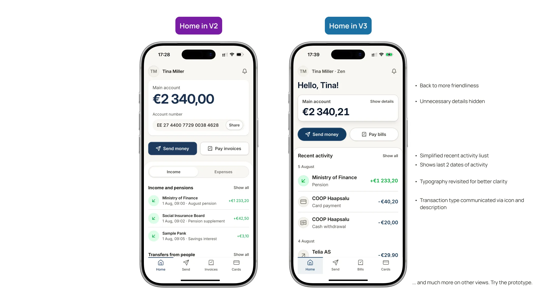
What I did in ~2 workdays to improve the concept:
- Reduced visual busyness — simplified the transactions list on the home screen; hid unnecessary details behind actions.
- Reduced transitions between screens.
- Increased contrast and borders — added borders to cards and buttons; added some heavy shadows in places; reduced eye candy for the sake of accessibility.
- Revised the type scale — chose new sizes from the Untitled UI React kit.
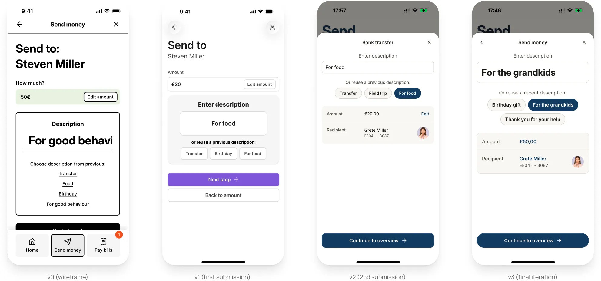
- Unified input area sizes — increased the description field size to suit the elderly better.
- Tested everything in dark mode — bad contrast decisions come forward much more easily in dark mode; I caught a lot of mistakes.
- Ran everything through A11y.md to fetch outstanding accessibility issues, and fixed what it found.
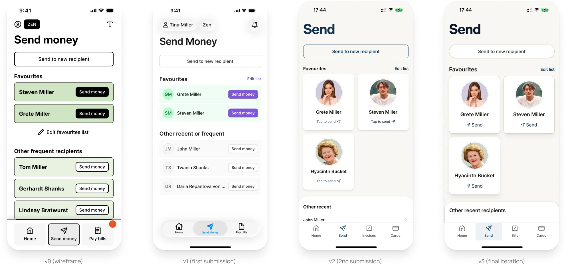
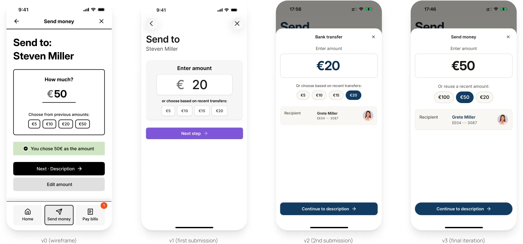
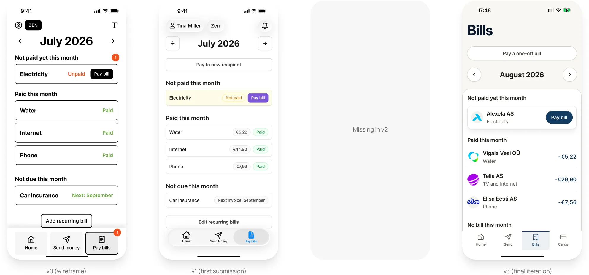
So, this is the final iteration of Zen Mode for now, which I consider a good balance between visual design and accessibility:
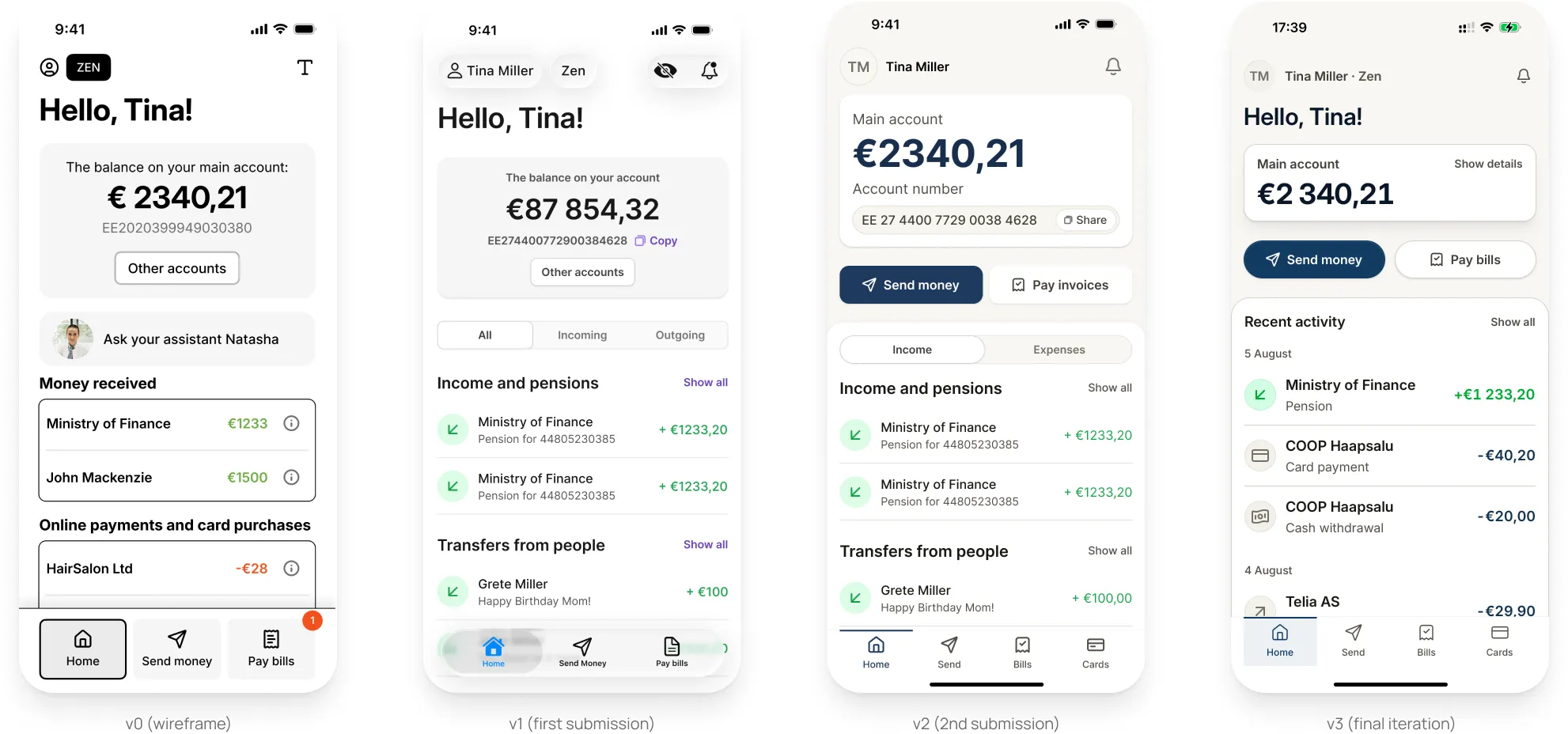
Final comparisons
Home screen
Send money
Enter amount
Enter description
Pay bills
Unexplored ideas
Customization
Zen Mode could be tailored to a person’s needs. Currently, many features are completely omitted from Zen Mode, but for some people these are essential.
Peer-approved transfers
Zen Mode could be set up so that a trusted person needs to approve any transfers.
Delayed transfers
Zen Mode could be set up so that any transfer takes an x number of hours to go through.
AI assistant with a name and face
The app could replicate “seeing a known face in the branch” with an intelligent AI assistant with a consistent avatar, who can help the user in natural language.
Extra warnings in case of a new recipient
For transfers to new people/companies, an extra warning could appear to make the user think twice.
Call for help button
Elderly users would benefit from a way to easily call someone for help from within the app. Not sure if the Customer Support department would manage the volume though :).
Email integration — automatic
In the current concept, recurring bills in “Pay bills” need to be set up manually. One idea to eliminate that would be to let the user sync their email inbox to the banking app. The app could then intelligently identify and set up recurring payments by analysing the inbox — potentially in real time, making it a true “inbox for bills”.
Manual email forwarding
A “low tech” version of the last idea: the user could forward invoice emails to an address (invoices@bank.com) so that the app can pre-fill all payment data and intelligently set up recurring payments after recognising a pattern.
Reflections
Interface design process
During my interface design process (v1 and v2 combined) I drew a wireframe (using a wireframe UI kit), then a basic mockup (using Untitled UI), then a better version of the UI (same design system), and only then coded it. I basically did double work to get to v1 to show my “craft” — which used to mean pixel-perfect Figma handoff files. But I missed the point: craft these days means fluent and efficient usage of the right tools, producing a polished result.
Lo-Fi and Hi-Fi
Drawing the screens in both lo-fi and hi-fi helped me ideate without thinking about the looks too much, but also meant I needed to learn two design systems (wireframing kit + Untitled UI). It probably would have been wise to use the hi-fi kit from the start.
Choosing the design system
I looked around for different design systems and eventually went with Untitled UI as a super comprehensible kit with coded React components readily available. For v1 I combined it with native iOS elements, as the mobile navigation patterns in the DS didn’t support an app look. In reality the setup would depend on the technical framework behind a specific app; for v2 and v3 I also created a custom navigation bar.
Double or nothing
I overshot a bit and wanted to cover two use cases — 1) sending money to people and 2) paying bills. This left me no time to go deeper into the concepts (setting up Favourites, for example).
Figma prototype
As I spent all this time drawing in Figma, I had no time to code the prototype for v1 and went the old-school way of linking up screens. This felt like a completely antiquated thing to do in 2026.
Accessibility
I intended to place a large emphasis on accessibility, making Zen Mode a large-text, high-contrast, big-button heaven. However, after playing with the accessibility features on my iPhone like I never had before, I saw that native apps adapt larger text sizes, higher contrast, more borders etc. beautifully. So for v1 and v2 I decided not to spend too much time on contrast and text sizes. That was a mistake — an app for the elderly can still have larger sizes and more contrast as a default. In the final iteration, I put lots of emphasis on that.
Research and validation
I loved doing this part of the process after quite a considerable break. It reminded me how genuinely helpful people are once you get them on a call or meet up. I also like how humbling the process is and how connected it made me feel to the cause and to actually helping these people (although it’s just an exercise).
What I took away
What might have been considered a show of craft in 2022 does not cut it in 2026. The new tools we have allow for much more speed, and to achieve pixel-perfect results by the time a 2022 designer would still be in lo-fi.
Going through fire and water, I now have a full understanding of the AI-first design process. I have a toolset I can use to much more effectively design interfaces and prototype them in code, using a design system to my exact specification.