Intro
| What? | A semantic, themeable design system for Pipedrive’s web app which later spun into a state-of-the-art design systems team. |
| Customer impact? | A more consistent, accessible and visually refined CRM experience across a large, complex B2B SaaS product. |
| Business goals? | Enable a visual refresh, reduce interface inconsistency, support future themes and brand updates, and help product teams ship higher-quality UI faster. |
| My task? | I envisioned the semantic token architecture and refactored all Figma components. Later as Design Systems Manager, I led the team and roadmap, set the quality bar, pushed for proper documentation and worked on cross-functional alignment with design and engineering. |
The problem
Pipedrive’s web app had grown increasingly inconsistent. The visual foundation was difficult to scale and adjust because colors did not have an abstraction layer and were used based on convention rather than clear semantic rules.
The challenge was not just to freshen the look of the product. We needed a foundation that could support product-wide change without redesigning every component from scratch each time.
Key problems
- Outdated and inconsistent product UI
- Color usage based on convention rather than clear semantics
- Limited support for theming and future visual updates
- Component quality varied across the system
- Designers and engineers needed a shared language for implementation
Semantics
I researched strong public design systems, including IBM Carbon and Atlassian Design System, and worked closely with engineering to define an architecture that would work both in Figma and in code.
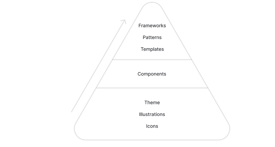
The system used a layered model:
1. Primitive layer
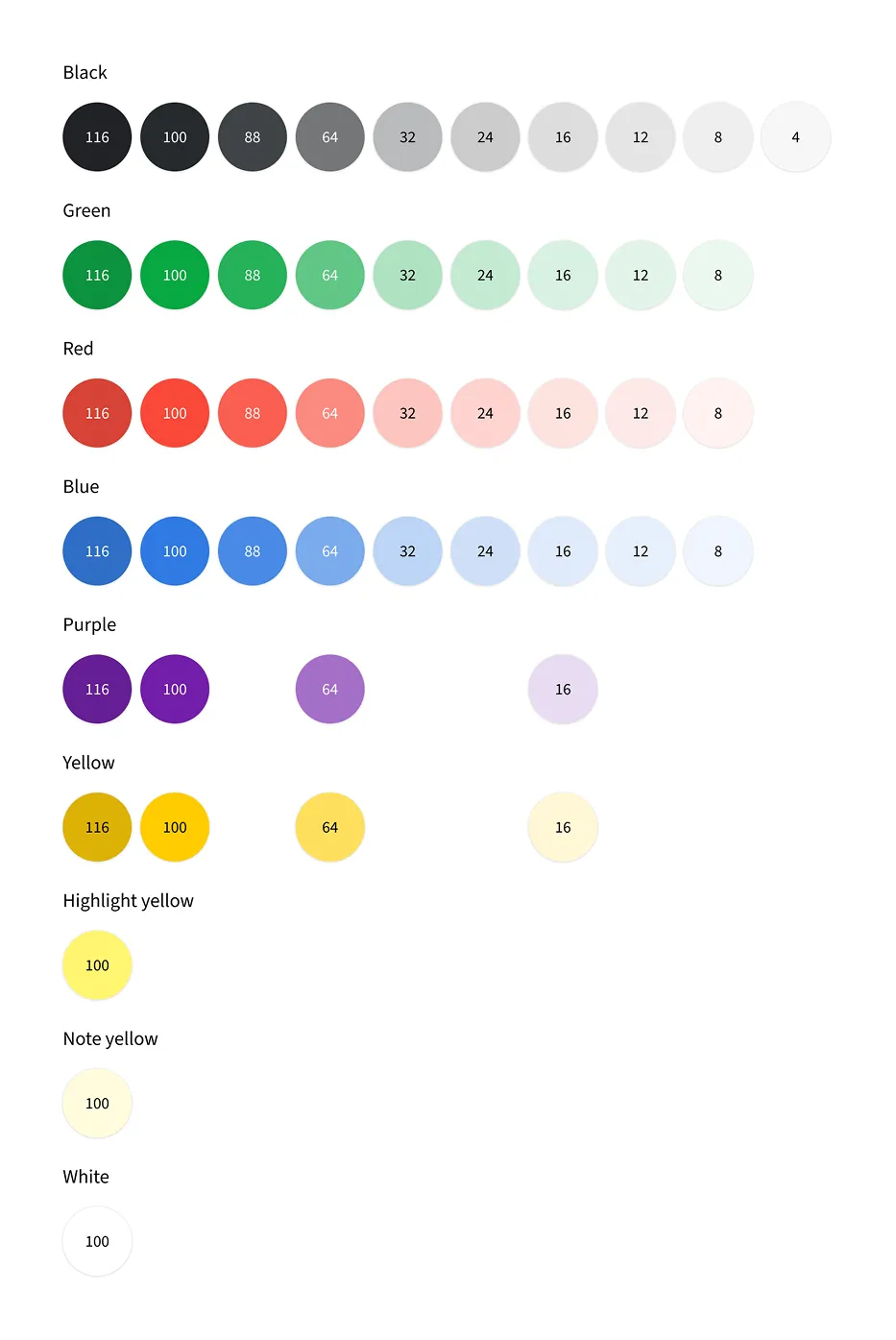
Theme-specific color scales, named independently from fixed properties like opacity. This made the system flexible enough to support future contrast-based palettes.
2. Semantic layer
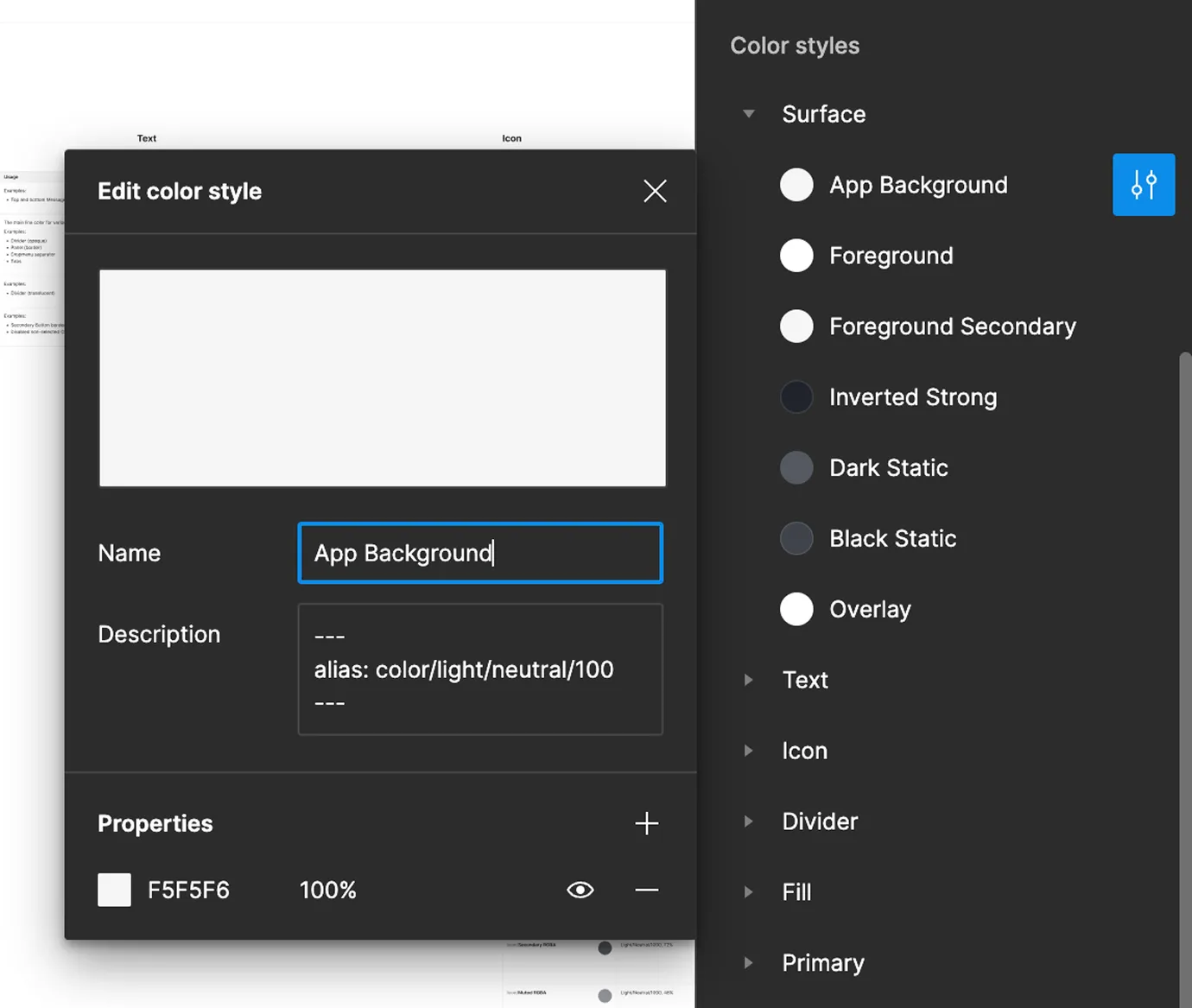
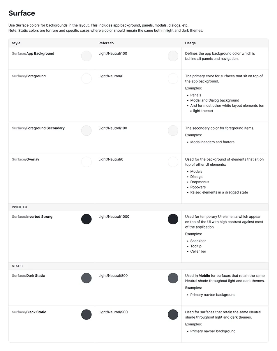
Usage-based tokens such as surface, text, icon, divider, primary, positive, warning and negative. These tokens described intent rather than raw color values.
3. Application layer
Components and product UI consumed semantic tokens instead of direct colors, making the interface easier to update, theme and govern.
This created a foundation where visual updates could happen through the system instead of through scattered one-off changes.
Tokens to UI
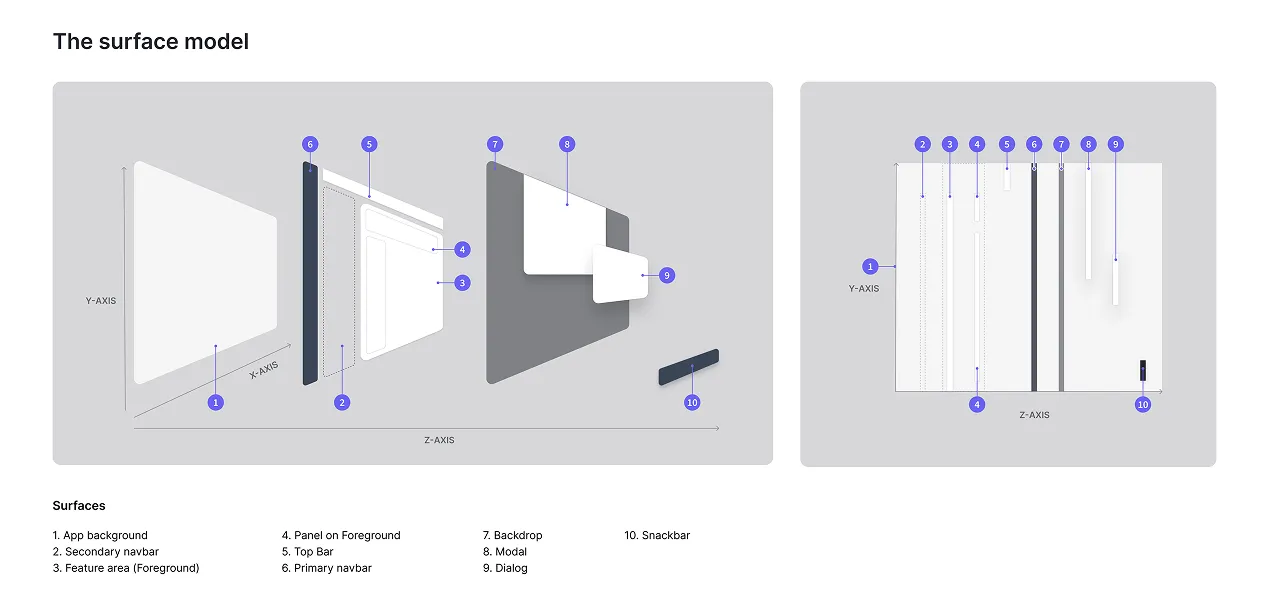
Pipedrive also needed clearer surface and elevation logic. Having created a necessity to create meaningful tokens forced us to clarify how surfaces should behave across the application. I created a surface model and used it to guide component decisions.
Then came the heavy operational work: refactoring every web app design component in Figma to use the new token structure.
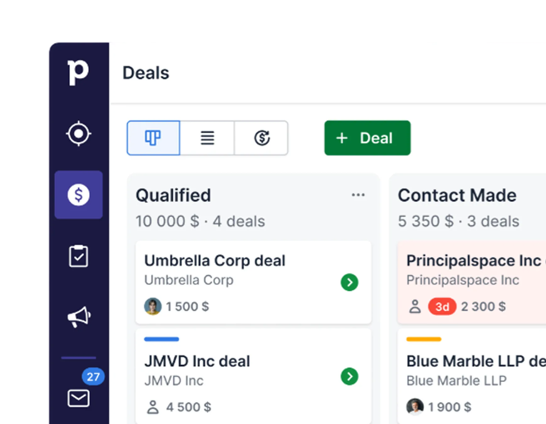
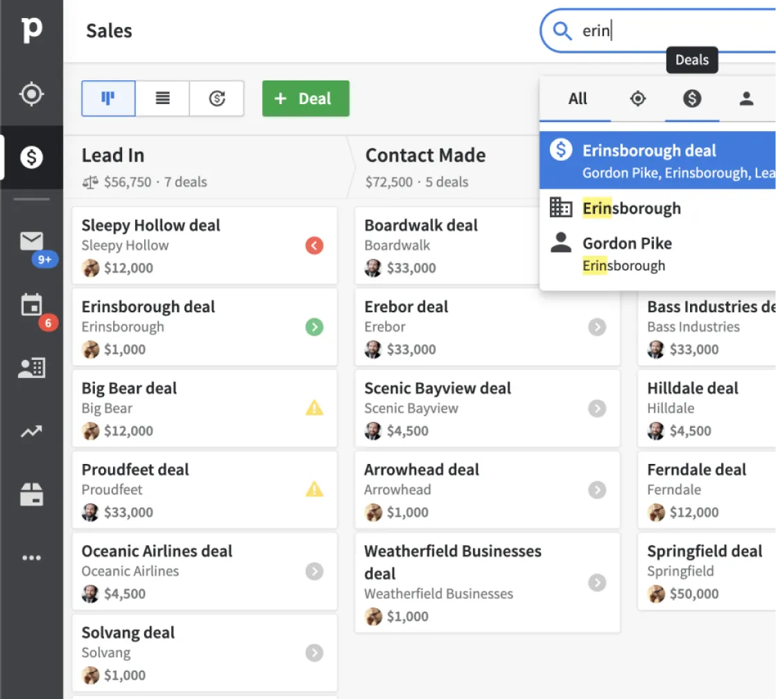
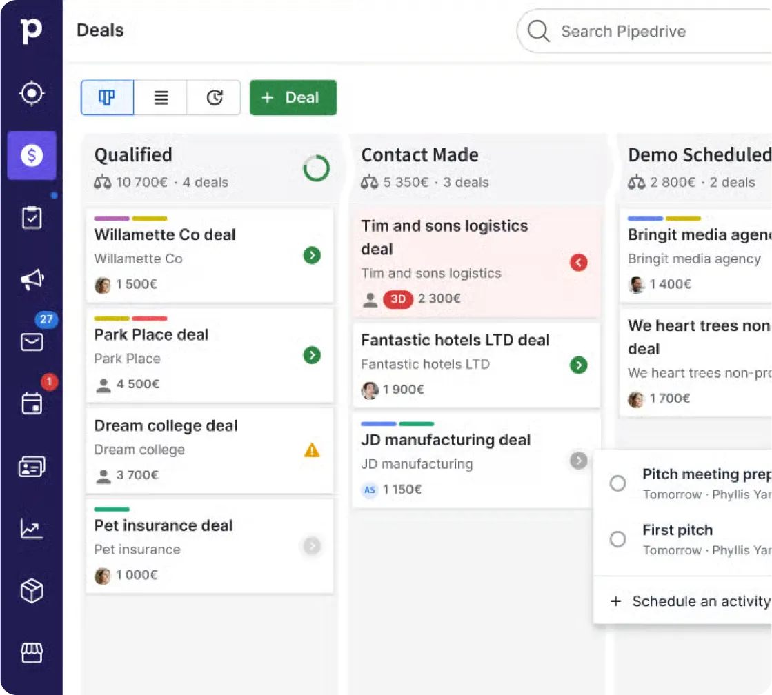
We also created a Classic theme to match the existing product and a Modern theme for the visual refresh. The Classic theme enabled us to move components and services to the new design system version without visible inconsistencies throughout the app. The Modern theme proved that the same system could support a refreshed visual direction.
Key design work
- Defined semantic color groups
- Created surface and elevation logic
- Refactored Figma components to use tokens
- Supported Classic and Modern themes
- Partnered with engineering to align Figma and code
- Created documentation patterns for component usage
Rollout
The plan
We created a Classic theme to match the existing product, and a Modern theme for the visual update. The original idea was to migrate the app under the Classic theme first, then flip the switch to the Modern theme later.
The reality
The refresh rolled out gradually as services were updated. Some contrast issues surfaced after release, which pushed the team to go deep into developing a contrast-based OKLCH color space palette which I had wanted from the start.
Brand update calling
(Very) shortly after releasing the Modern theme, a brand update introduced new colors and semantics. The system absorbed it beautifully without becoming a rebuild.
Leadership
The initial semantic system was only the start. The larger challenge was scaling it across a product organization.
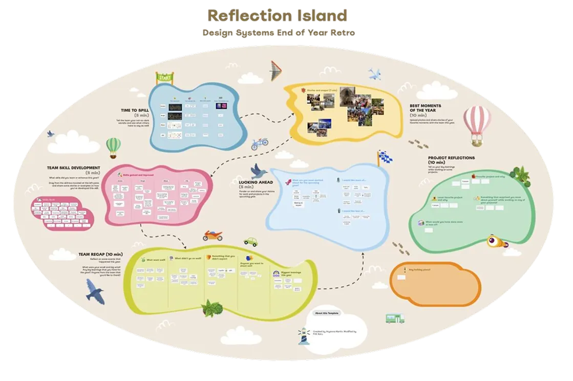
As Design Systems Manager from 2022–2024, I shifted focus from individual system contribution to team leadership, roadmap ownership and adoption. I worked with the team to define the mission and vision for Pipedrive’s design system, created yearly roadmaps, improved component and documentation quality, and strengthened collaboration with Product and Engineering leadership.
The design system team operated like a product team: our users were product designers and engineers, our product was the system, and our success depended on trust, usability, reliability and adoption.
Leadership focus
- Defined team mission, vision and roadmap
- Improved component quality and documentation standards
- Supported designers using the system in daily product work
- Partnered closely with engineering leadership
- Built a stronger operating model for the design system team
- Helped the team deliver dark mode, customizable navigation and accessibility improvements
Results
This new design system enabled Pipedrive to carry out visual updates with far less technical friction. When a later brand update introduced new colors and semantics, the system was flexible enough to absorb the change without becoming a rebuild.
The design system matured from a component library into product infrastructure. It supported multiple themes, improved consistency, raised the quality bar, and gave designers and engineers a shared foundation for product work.
Results
- Enabled a themeable semantic token system
- Supported product-wide visual updates
- Created a foundation for dark mode and later brand updates
- Improved component quality and documentation
- Helped 40+ designers work from a stronger shared system
- Improved accessibility through contrast-based colors
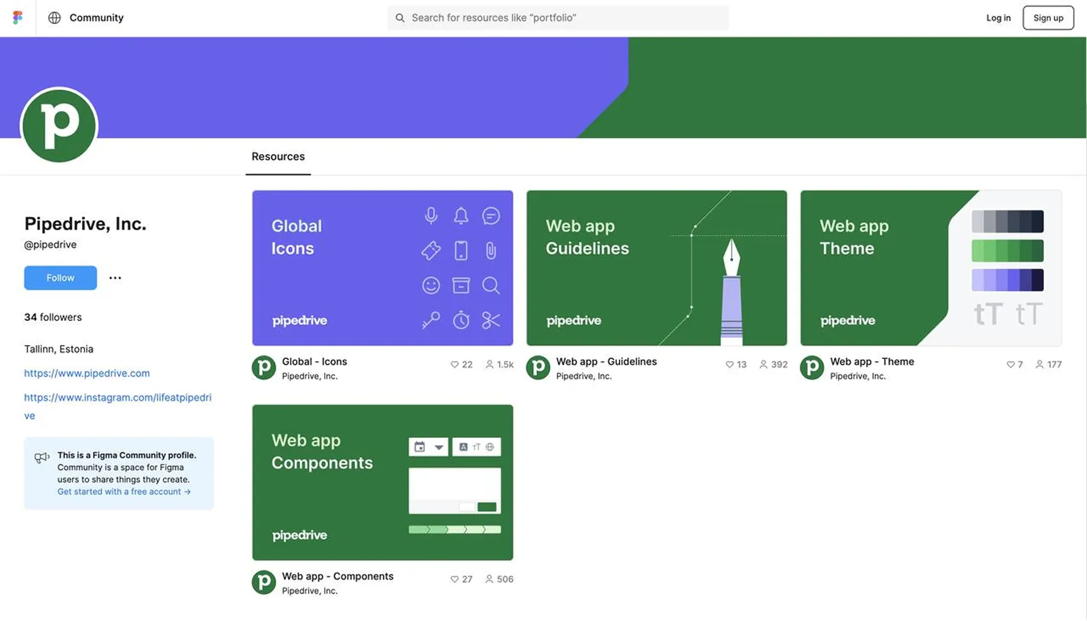
- Raised confidence in the system enough to publish it publicly on Figma Community at the time
Main takeaway
A design system is not only a Figma library or code package. It is a product, a contract and an operating model. The technical architecture matters, but adoption depends on trust, documentation, governance and the team’s ability to support real product work.