Intro
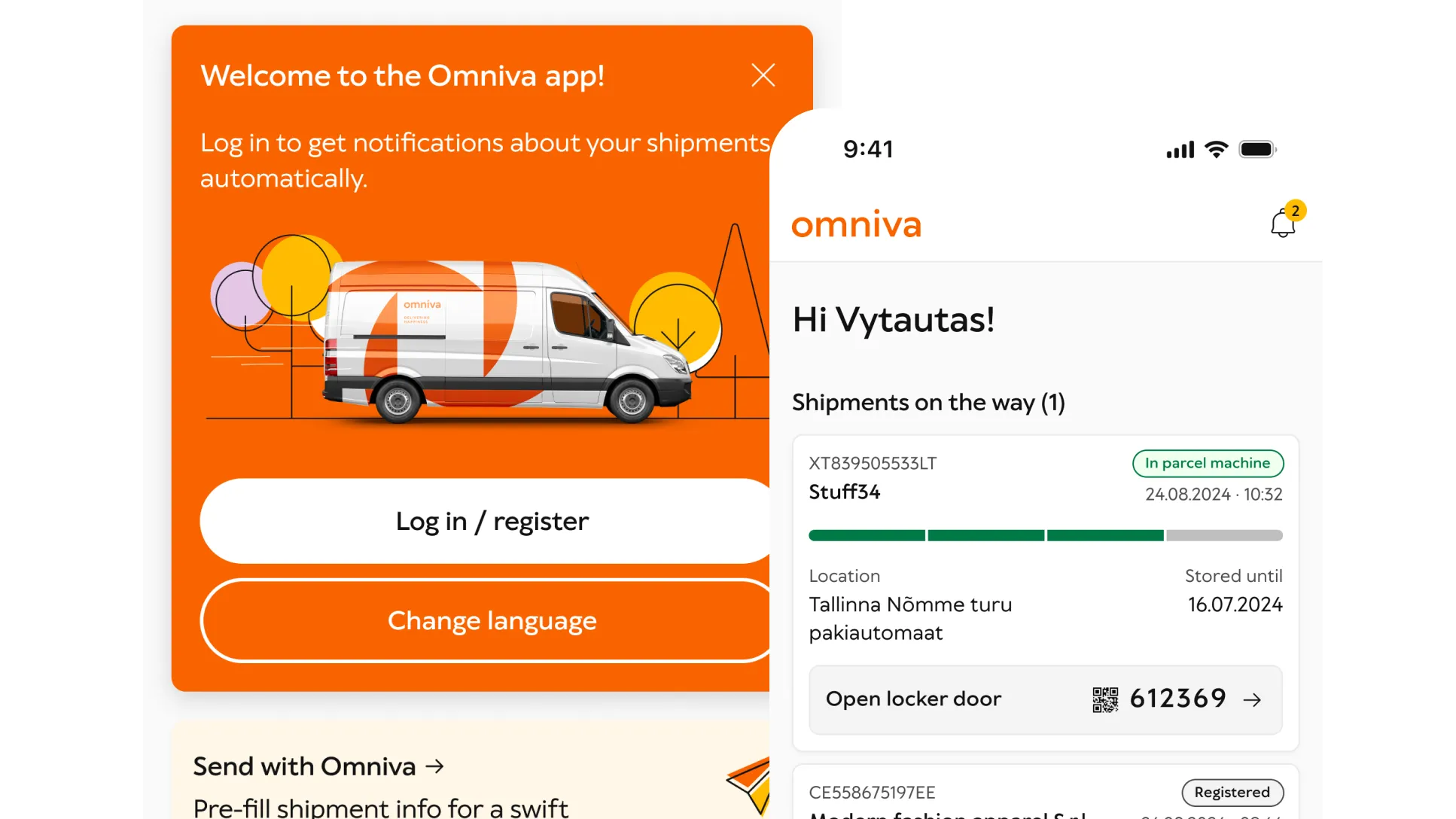
| What? | Shipment tracking and parcel management app. |
| Customer impact? | Traditional shipment tracking is a cumbersome copy-paste exercise across text messages and websites, making it prone to fraud. We wanted to establish a trustworthy and convenient channel for our customers. |
| Business goals? | Reduce SMS costs, reduce reputational damage from fraud and form a platform habit for future offerings. |
| My task? | Fix the usability of the initially released app. |
1. Discover
Primary research
I interviewed the engineering team, involved designers, PMs and the CTO to gauge the state of the project, expectations and current state. I conducted usability interviews with the general public.
Secondary research
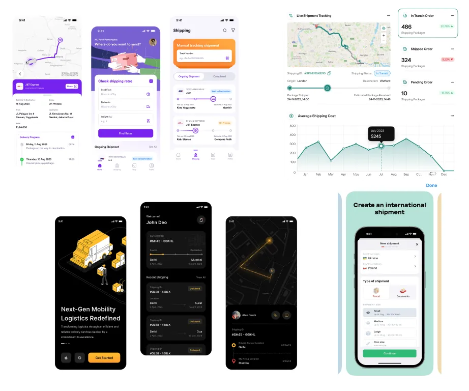
I analyzed the app that had been developed. I looked at competitor apps to be able to include the best patterns in our product.
2. Define
AI-assisted synthesis
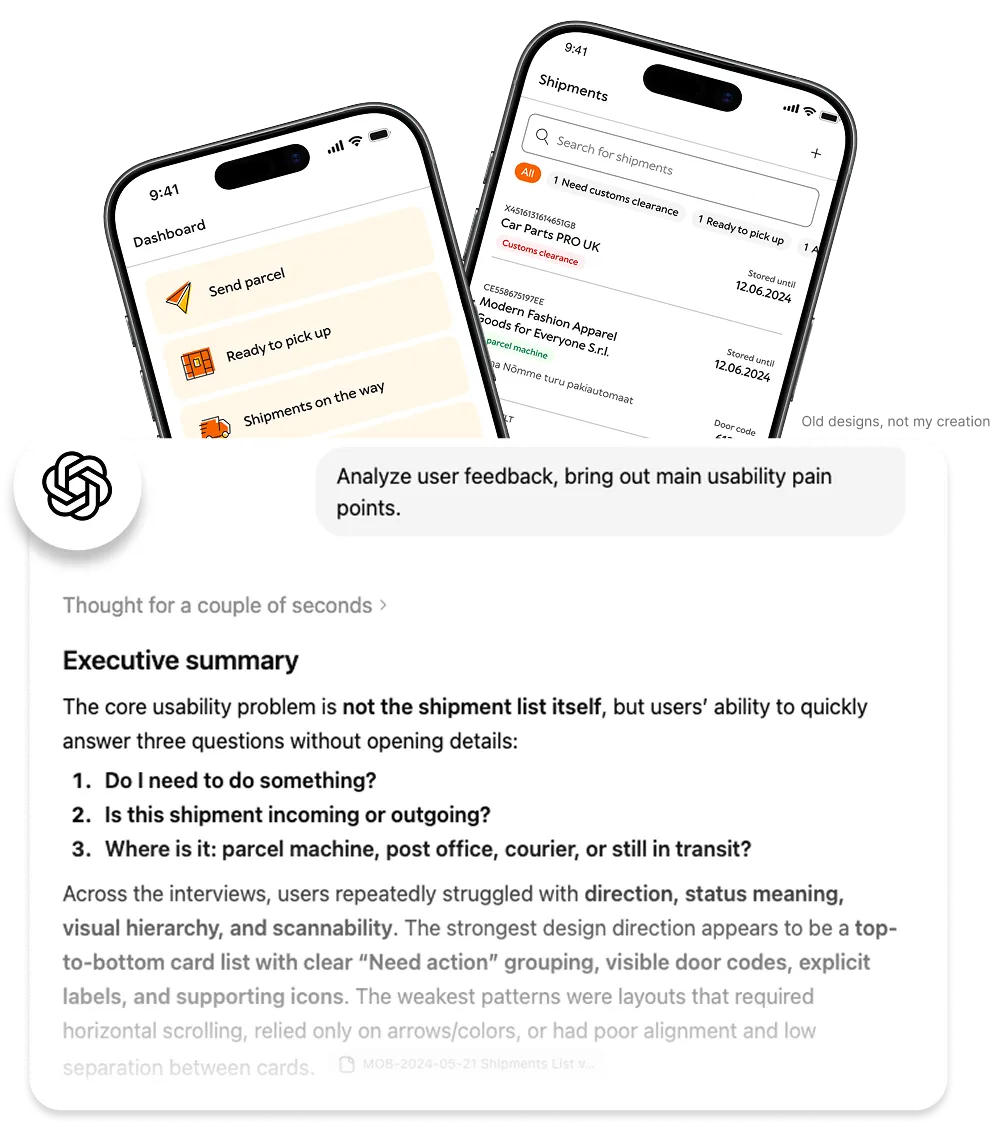
Corporate AI use was still in its infancy. I used ChatGPT to analyze interviews.
Distill
The developed app did not quickly answer simple questions like: do I need to take action? Is this shipment incoming or outgoing? Where is my latest order? Not to mention the numerous technical bugs undermining usability.
Action
I decided to fix the foundations for a denser UI, design a home screen focused on actionable shipments, and update the shipment card component for better scannability.
3. Develop
New foundations
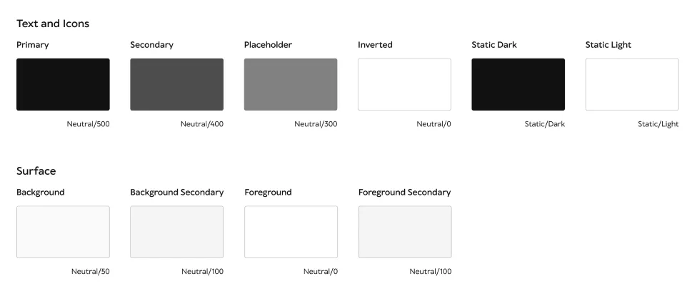
I created an MVP semantic color system to enable more visual depth and theming.
New shipment card
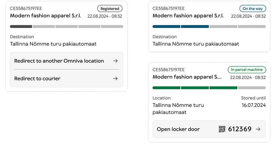
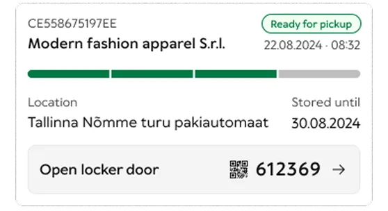
I crafted the shipment cards into modular pieces, efficiently housing all the relevant information and action areas.
Simplified statuses and progress bar
I identified all possible statuses and simplified them to form a 4-step color-coded progress bar for clarity.
Door code display + QR code scanning
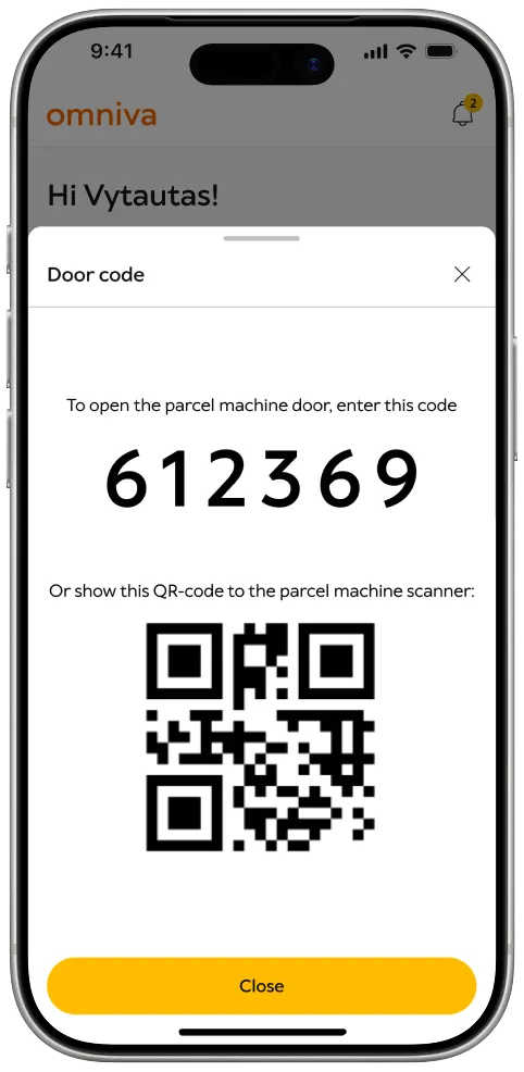
I improved door code legibility and added the detail view which shows a huge version and a QR code. This new way of opening the parcel machine door by showing a QR code was my initiative, developed in cooperation with the parcel machine team.
Free access to tracking
We changed the app architecture to allow manual shipment tracking without logging in.
5. Home screen
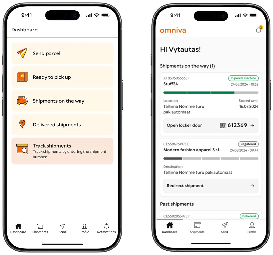
Problem with the old app
The home screen was a collection of links.
Design decisions
I created an architecture where all active shipments were displayed on the home screen, followed by three finished shipments.
What was solved?
Shipments needing attention became the first thing after opening the app.
6. Shipments list
Problem with the old app
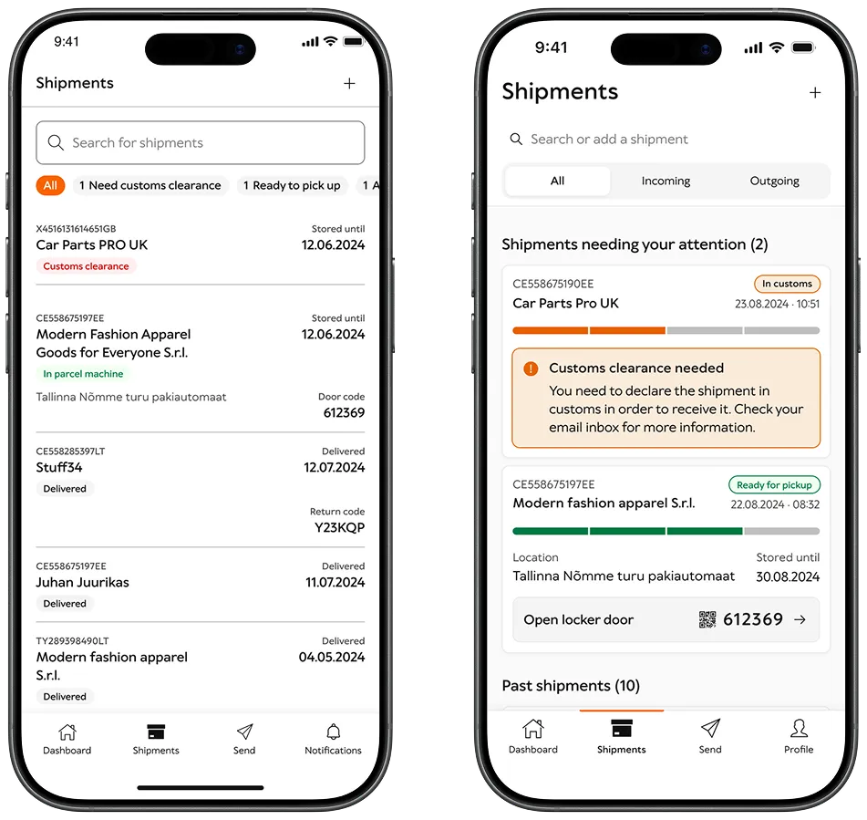
The shipments list was hard to scan. The status-based filters were redundant. There was no good way to identify the direction of a shipment — did the user send or receive?
Design decisions
I redesigned the shipment cards, organised them in groups based on urgency (1. action needed, 2. shipments on the way, 3. past shipments), and added a directional filter (All, Incoming, Outgoing).
What was solved?
The list was now easier to scan and a simple All / Incoming / Outgoing control was implemented.
7. Development and release
After validation
The home screen, shipment list, visual progress indication and improved door code display were positively received by users. I polished off some details and handed the design off for development. After some weeks the app was ready to be made public.
Marketing campaign
We planted subtle marketing banners in the self-service portal to raise awareness.
8. Results
Successfully validated with users
The home screen, shipment list, visual progress indication and improved door code display were positively received by users.
App Store rating increased
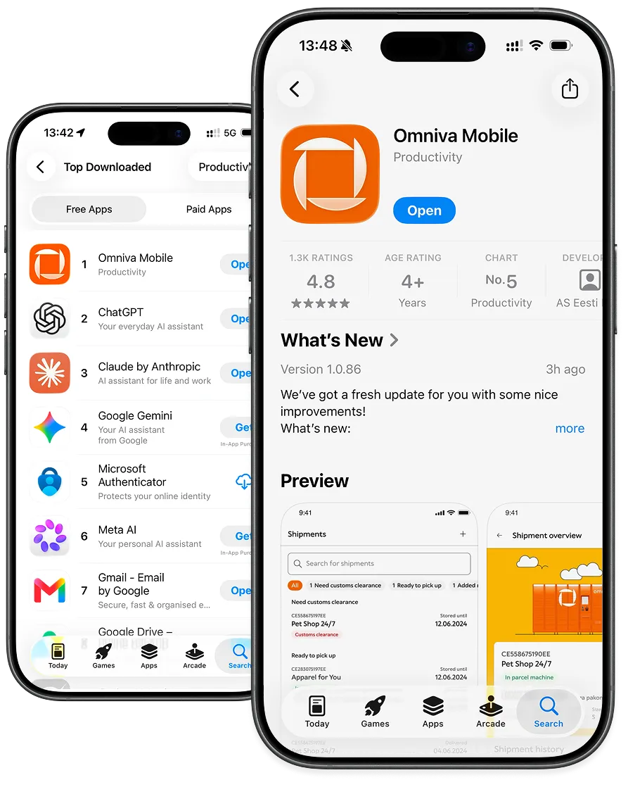
App Store rating increased from 3.5 to 4.8★ in the three months after the updated app was released. As of August 2026 the app is the #1 downloaded Productivity app in the iOS App Store in Estonia.
Sticky app
Over 100k downloads with more than 50% monthly stickiness and more than 30% weekly stickiness.
Room for improvement
Technical stability needed more work. Shipment ETA emerged as a much-wanted feature. Returns shouldn’t have been considered an edge case.