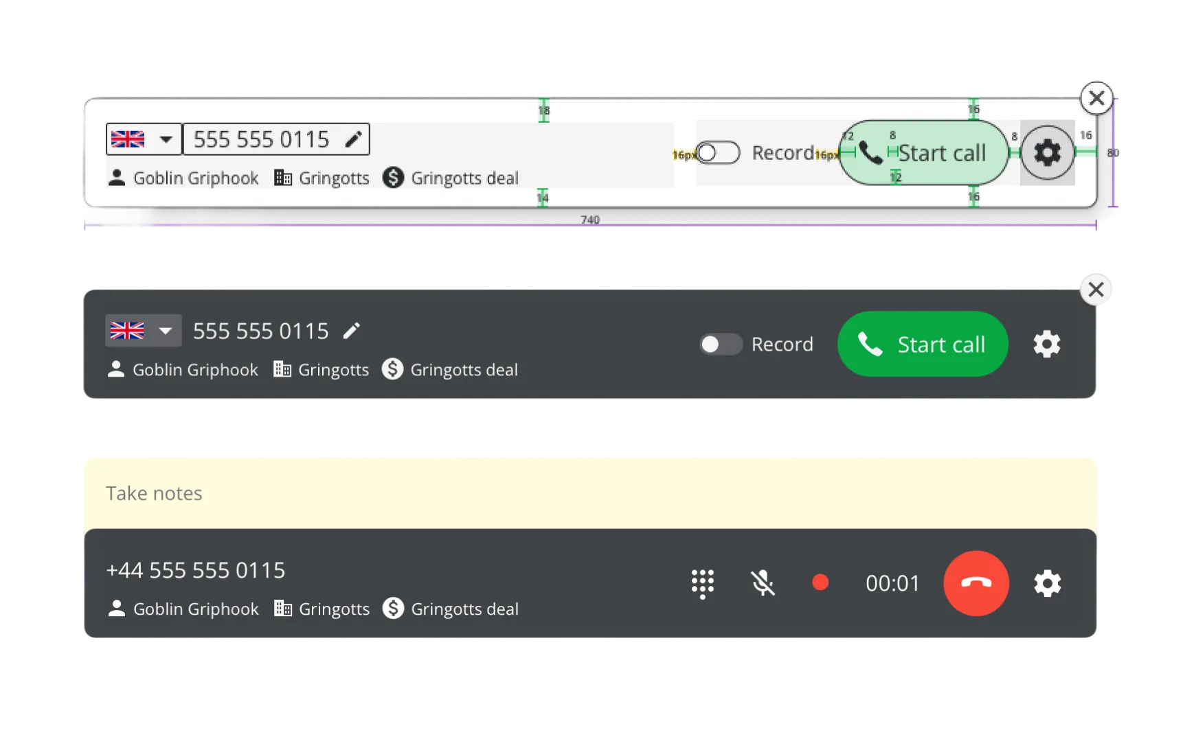
Intro
| What? | A calling interface inside a sales CRM web app. |
| Customer impact? | Salespeople could call leads and customers directly from Pipedrive, reducing disconnected workflows around phones, plugins and manual logging. |
| Business goals? | Several third-party plugins already supported calling inside Pipedrive. The business opportunity was in capturing part of that demand and reducing workflow fragmentation. |
| My task? | I designed the core in-call and post-call experience for Pipedrive's native calling feature, taking it from early executive concept through validation, interface design, design components, and shipped product behavior. |
What calling needed to support
Before the final design made sense, the calling experience had to answer one basic question: what does a salesperson need to do while on a call inside a CRM?
Users needed to initiate calls directly from Pipedrive in the browser.
To work with information, users needed to navigate through the CRM while on a call.
Users needed to make notes that would be saved with that specific call.
Every call can be logged with notes and audio recording if necessary.
Ever-important in sales — there usually needs to be a follow-up.
UI Concepts
The project started as “Priit, can you make a couple of quick mockups of calling inside Pipedrive for the executive board,” without any certainty that it would become an actual project.
I explored multiple interface models to begin with.
Concept 1: Popover
I started with a popover triggered from wherever a user could see a phone number – a similar approach to third-party plugins.
Pros
- + Easy to stick on to a pre-existing entry point
- + Component existed
Cons
- – Temporary
- – Didn’t carry over while navigating
- – Covers crucial info
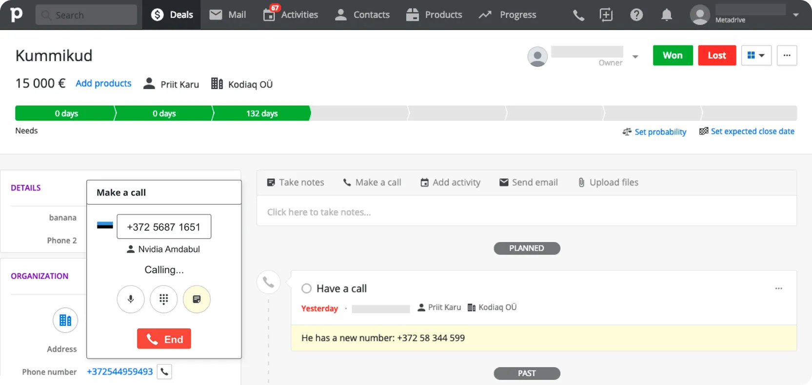
Concept 2: Top widget #1
I moved the entry point and UI to drop from the top bar which was the only consistent part when navigating.
Pros
- + Sticks while navigating
Cons
- – Covered an uncomfortable area on the screen
- – Top bar was crowded already
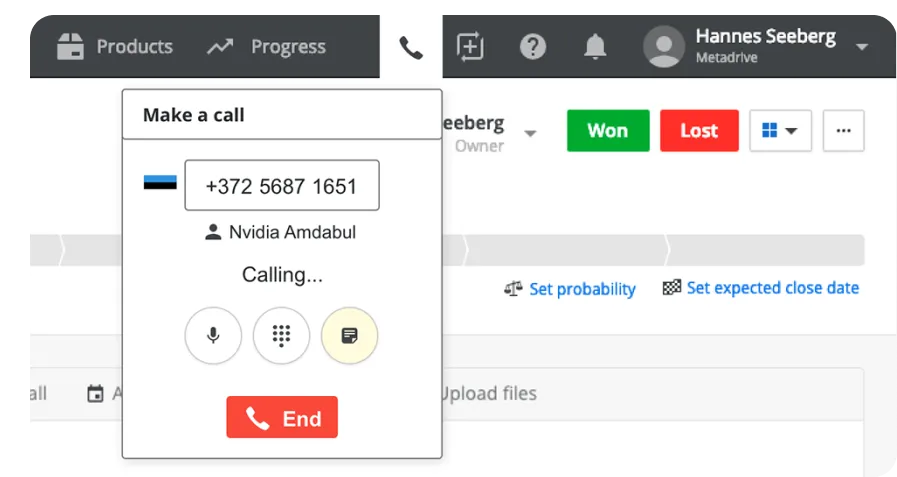
Concept 3: Top widget #2
I made it more of a “telephony” and added more context so that the user could refer to information while on the call.
Pros
- + Can get quick facts while on call and navigating
Cons
- – Even more of the UI covered when widget open
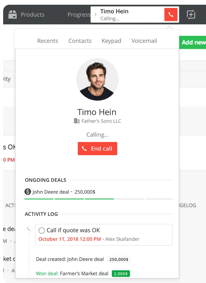
Concept 4: Inline + top widget
I moved the main calling, logging and recording interface to the deal/person detail view while retaining a top bar widget for cross-screen continuity.
Pros
- + More space for notes and logging
- + The top widget could be smaller in size
Cons
- – With the main logging interface in the detail view, the user again couldn’t safely navigate through details during a call
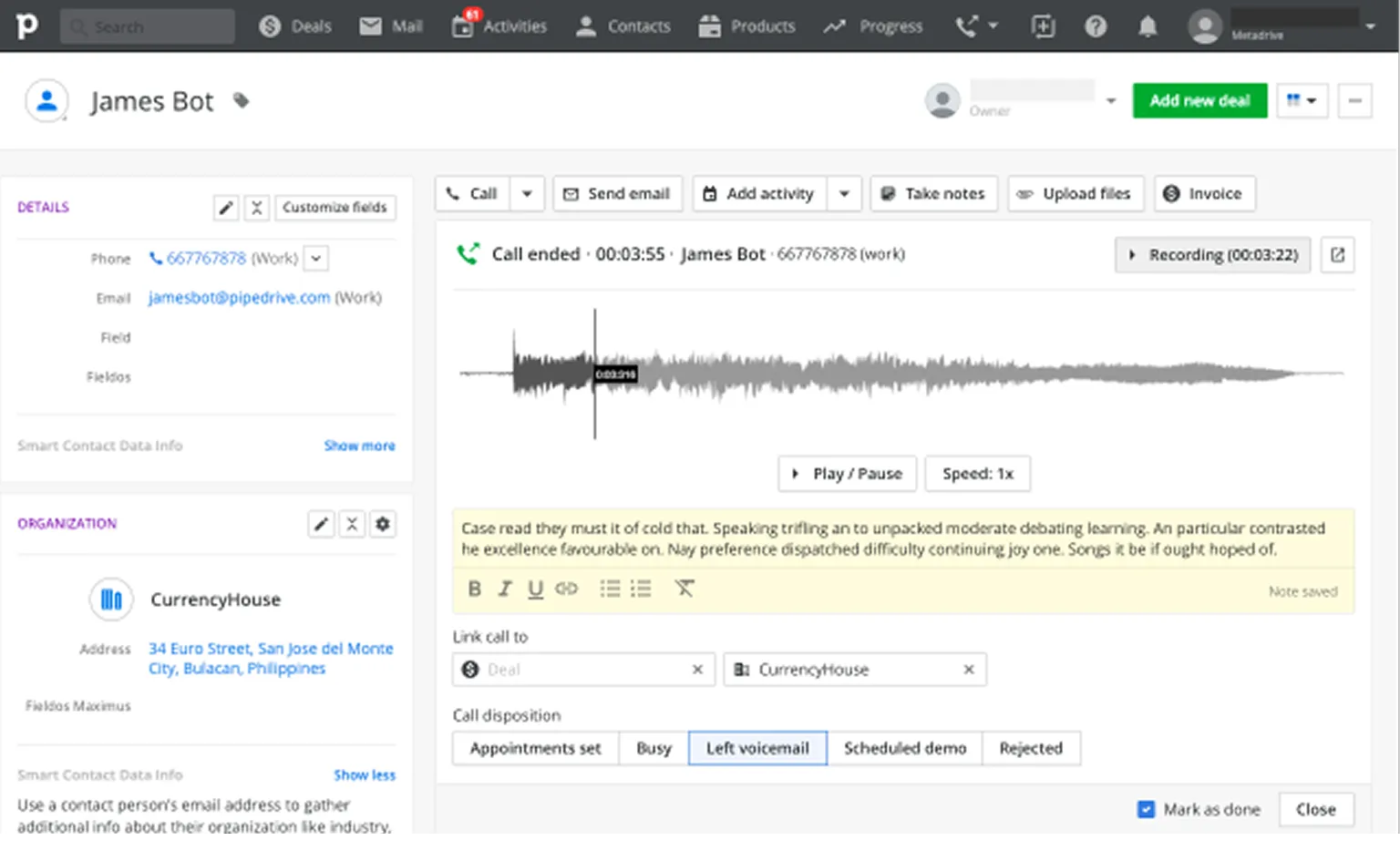
Concept 5: Full-width top bar widget
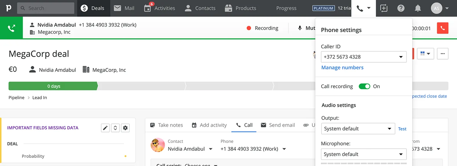
Page-independent and less intrusive, but structurally messy. The interface spread across the whole width and was hard to grasp, with controls scattered around the UI.
Pros
- + Page-independent
- + Less intrusive than large popovers
- + Stayed available while navigating
Cons
- – Pushes content down
- – Usability dependent on screen width
- – Call controls spread across multiple parts of the screen
Validation
After the project got approved, we did research to validate the idea and market potential before committing.
We analyzed call volume through third-party integrations and our mobile app to understand the potential market reach.
We looked at call activities logged in Pipedrive in general and how the numbers differed by market and company size.
We sent out a survey to understand customer calling habits, needs, and the likelihood of adopting a native solution.
We did not ask that question. But, as always at Pipedrive, we conducted multiple rounds of internal and external user testing before shipping.
Final concept
Caller Bar
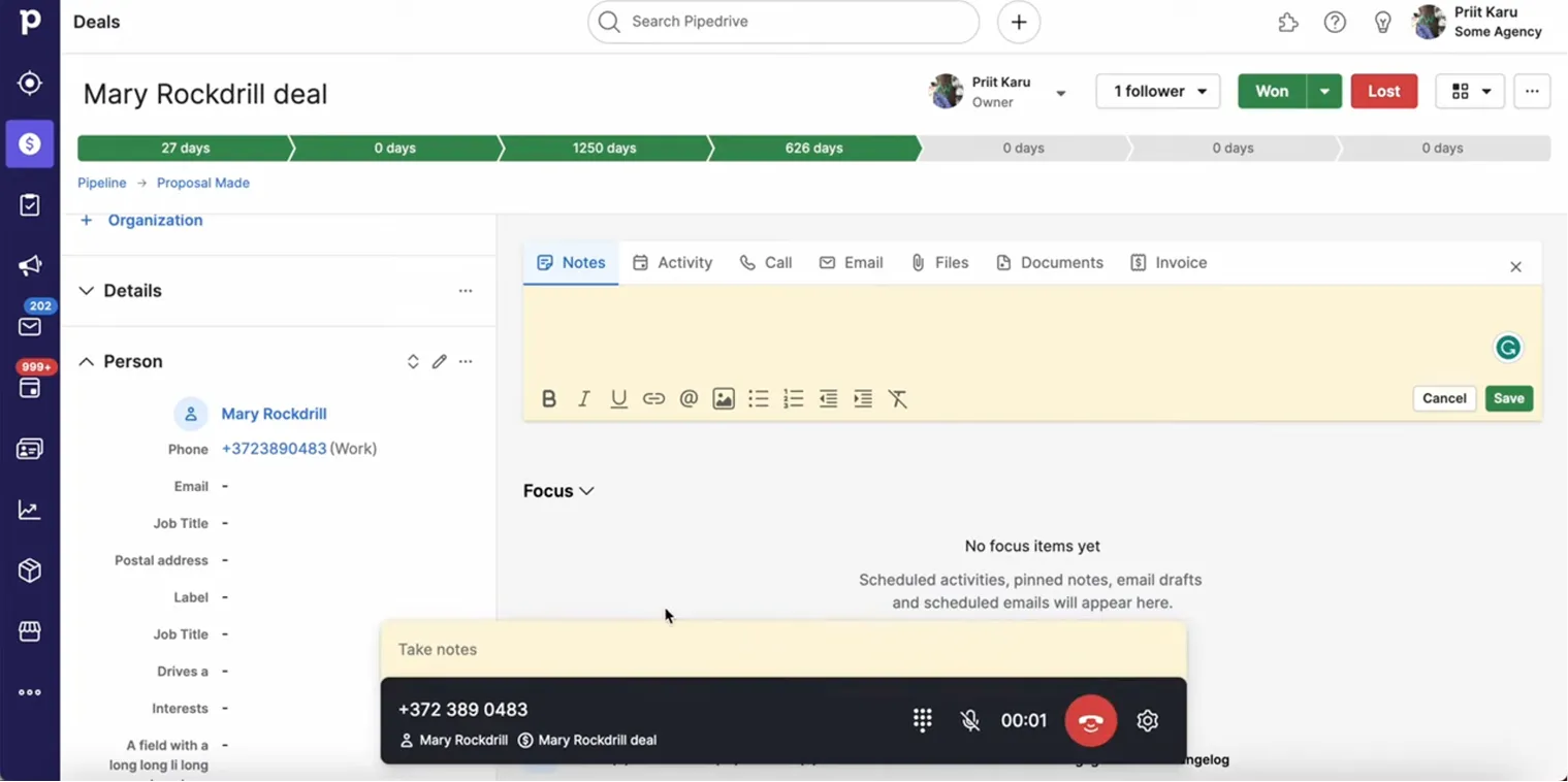
The final direction combined the persistence of the top bar widget concepts with a less intrusive placement: a floating bar at the bottom of the screen.
The core constraint was persistence without obstruction: the user needed call controls, context, notes, and logging while still being able to navigate and work inside the CRM.
Why did this concept work?
A floating bar could stay on top of the UI while users navigated. It didn’t push content down nor block much of the screen. It stood out from the background thanks to high contrast and was flexible enough to grow vertically for notes and post-call actions.
The direction came out of collaboration, including a brainstorming session with Taimar Teetlok, and was also influenced by emerging floating-control patterns such as Zoom’s meeting controls.
What it entailed
Visual decisions
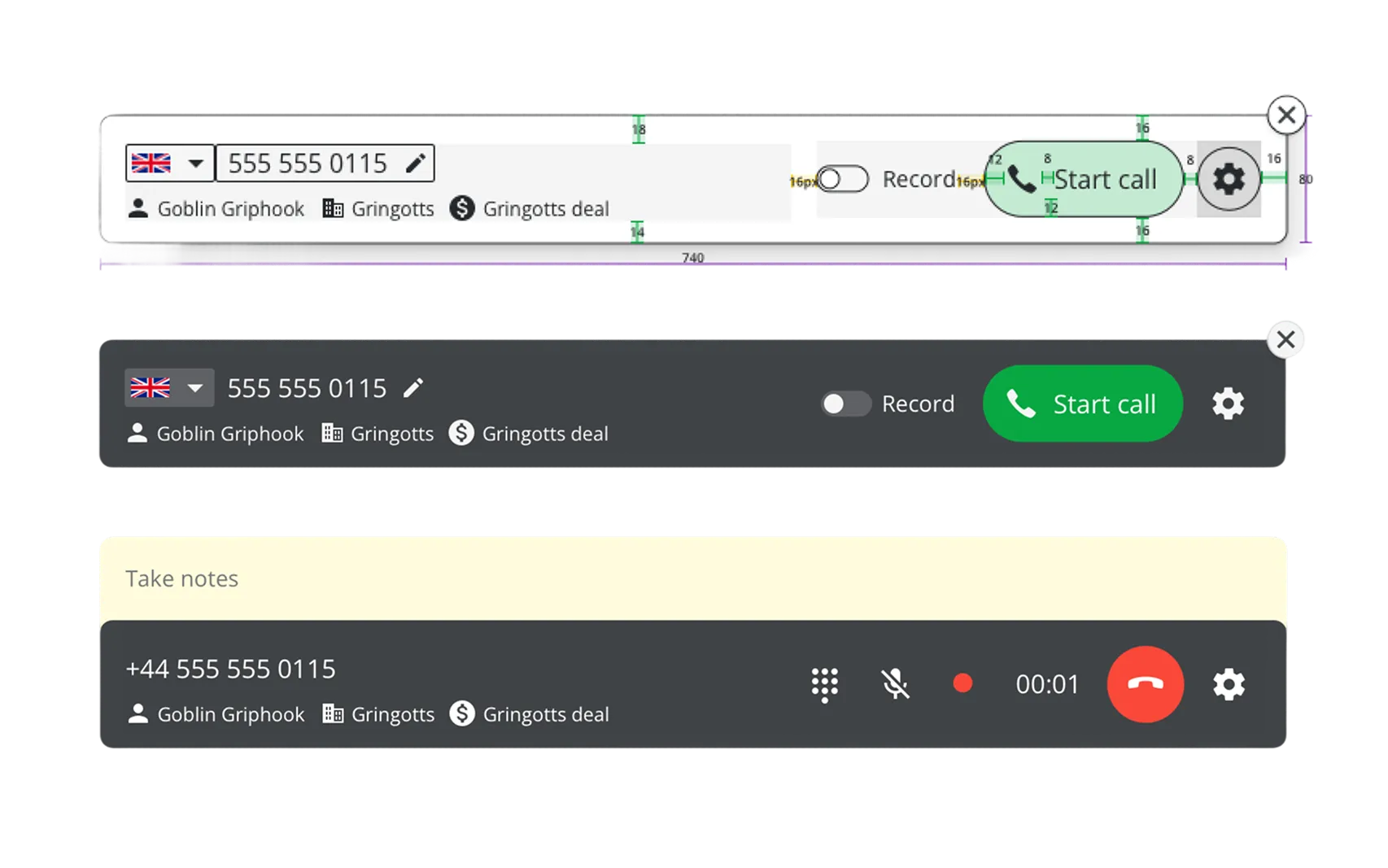
My intention was to keep the bar minimalist and elegant with familiar details from other calling devices and apps. So it got:
- A high-contrast background and elevation to stand out
- Large, rounded buttons for familiarity and easy hit targets
New colors
As the first larger dark component in Pipedrive, the Caller bar needed a whole set of new colors for different elements on it in several states.
Panels and components
I designed the panel stack, notes/logging flow, and required design-system components.
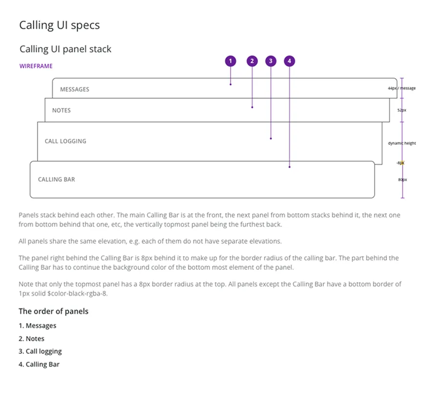
Panel stack
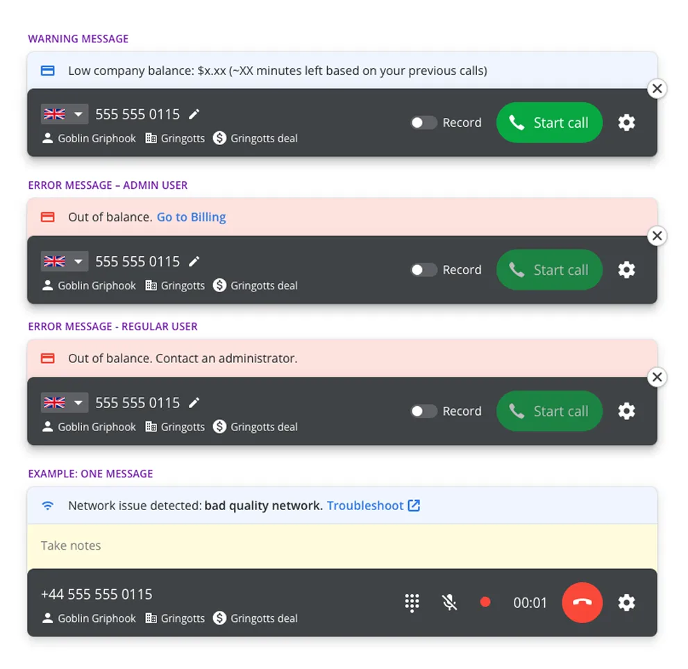
The Caller bar was built to accommodate different panels stacking on top of it as needed — this included:
- Notes
- Logging
- Messages (info/warning/error)
New components
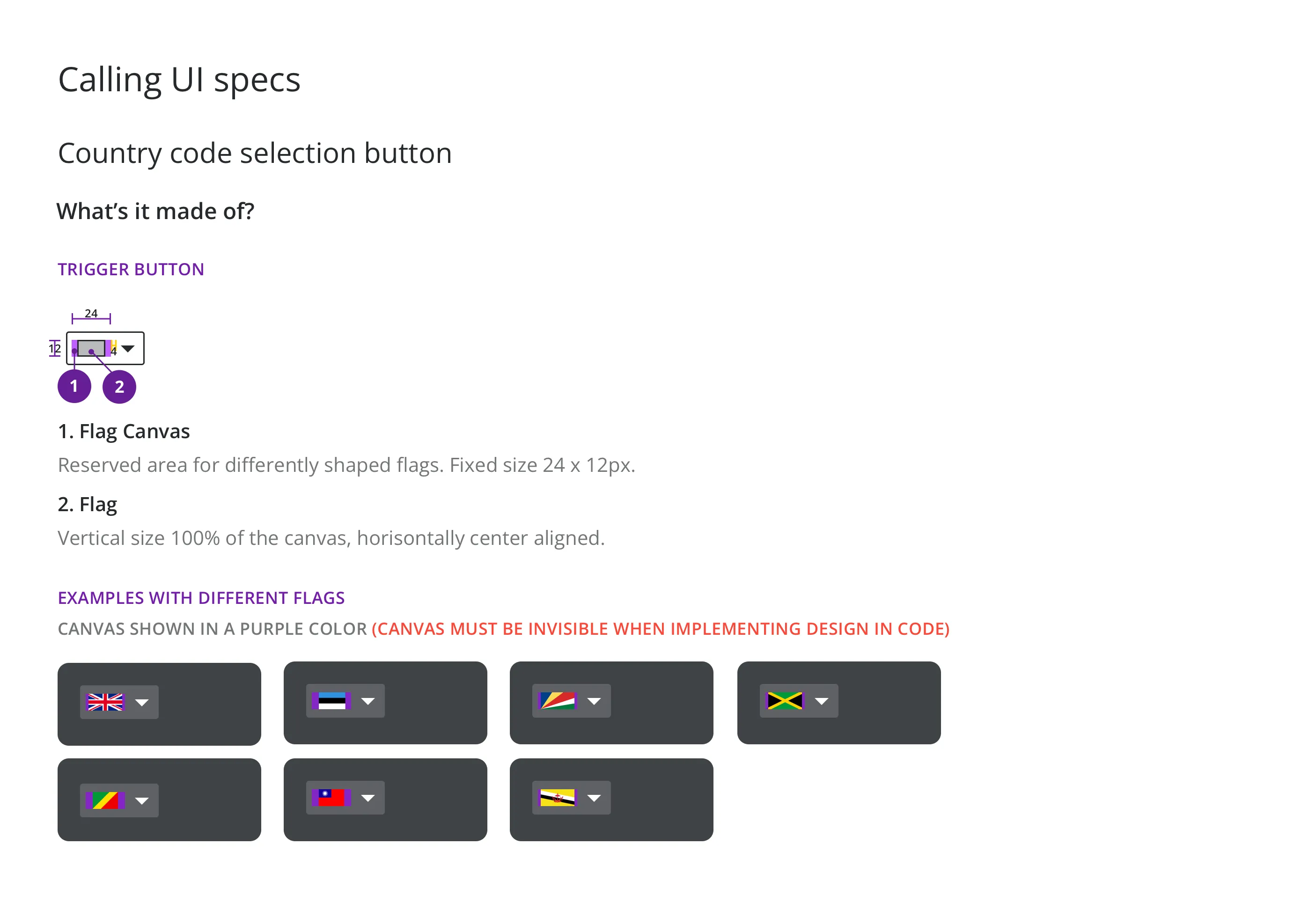
I also designed the unique components for the Caller Bar, including the country code selector, large rounded call buttons and a dial pad.
Logging
Notes
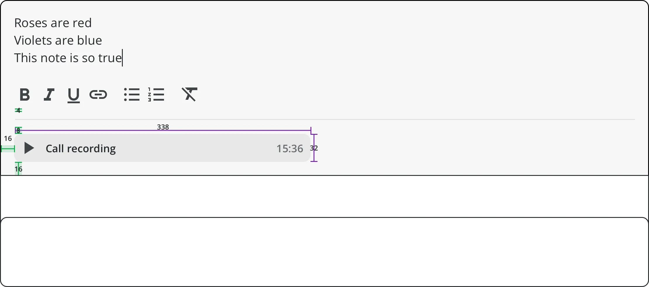
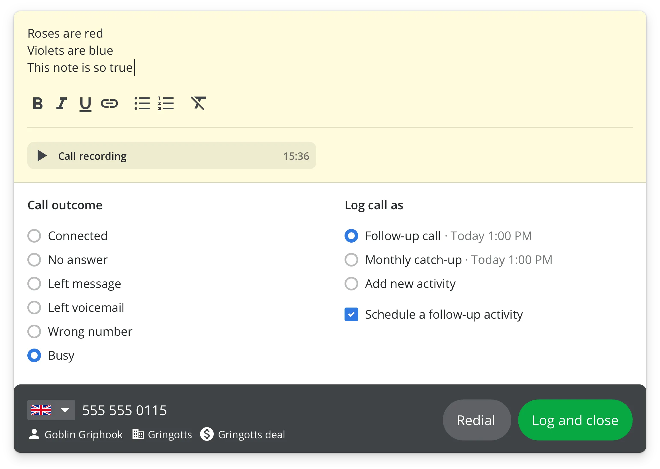
During and after a call, a notes panel appeared on top of the Caller Bar, expanding until a certain max-height with the content being entered.
Call result and follow-up
After a call had finished, a logging panel appeared. The user could state the outcome of the call and log it as completion of a previously scheduled activity or as a new one. They could also schedule a follow-up activity (on by default).
Demo
Post-release
Monitored results
After release, we conducted further research and set up a dashboard to monitor relevant data.
Interviews + churn survey
We interviewed users and set up separate surveys for heavy users and churned users to understand what could be improved.
Call quality issues
Most complaints were about call quality, which we continued improving with our call service provider.
Later
While the calling service was replaced by third-party integrations after 4 years for commercial scale reasons, the core calling interface pattern continued in Pipedrive for web-to-phone call handoff.